Documentation Center

Knowledge articles on Technical Analysis Indicators, Chart and Candlestick Patterns supported by ChartMill stock charts and stock screener.
Indicators
Accumulated Volume Indicator
The Accumulated Volume Technical indicator on the charts.
VWAP (Anchored and Moving)
The Moving or Anchored VWAP (Volume Weighted Average Price) indicator is available in the ChartMill stock charts.
ATR based stop (chandelier stop)
An indicator to show the value of a stop with distance based on the Average True Range
Chartmill Channels
A Chartmill Channel is a horizontal channel wherein prices move sideways

Chartmill Trend Indicator
The Chartmill Trend Indicator indicates whether a trend is positive, negative or neutral.
Relative Strength Performance Filter
Relative Strength measures price performance of a stock relative to the other stocks in the market.
Dorsey Relative Strength
Dorsey Relative Strength compares the security to an index
Mansfield Relative Strength
Mansfield Relative Strength as used by Stan Weinstein

Pocket Pivots
A Pocket Pivot is a price/volume pattern that reveals an interest of large players and is available in our charts and stock screener.
Chartmill Market Breadth Indicators
Some market breadth chart indicators provided by ChartMill
5BP and 7BP Swing Point or Fractal Stop
An indicator to show the value of a stop which is moved on swingpoints
Effective Volume (EV) and Effective Ratio (DER)
Effective Volume looks at intraday volume to analyze accumulation and distribution by large players
Strong Stocks
Strong stocks are consistent strong performers in the market
Trend Intensity Indicator
The Trend Intensity indicator measures the strength of the trend.
Overbought or Oversold: Chartmill Value Indicator and Dynamic RSI
Using the Chartmill Value Indicator and Dynamic RSI to find overbought or oversold levels
Chartmill Technical Rating and Setup Quality scores
View the technical health and setup quality of any stock with these ChartMill ratings.
Chartmill Consolidated Support and Resistance
Consolidated Support and Resistance combine support and resistance from several indicators and time frames
Stan Weinstein stage analysis in chartmill
Weinstein stage analysis in the ChartMill charts and screener
The RSI Indicator: What Is It And How To Use It?
The RSI indicator (Relative Strength Index) is a widely used momentum indicator in technical analysis. It was developed by J. Welles Wilder Jr.
The MACD Indicator - Moving Average Convergence and Divergence
The MACD indicator is a technical analysis indicator used to determine the strength, direction and duration of a trend. This article it about its practical usage.
How To Find Support and Resistance?
Learn how to find support and resistance levels using technical analysis tools, such as horizontal and diagonal trend lines, moving averages, and Fibonacci retracements.
The Simple Moving Average (SMA)
The Simple Moving Average, definition and Formula
The Exponential Moving Average (EMA)
The Exponential Moving Average | Definition and Formula
The Smoothed Moving Average (SMMA)
The Smoothed Moving Average, definition and Formula
How to Use Moving Averages to Determine the Trend?
Moving averages are an ideal tool to determine the price trend of a share. How to do that and which things to take into account is discussed in the article below.

Understanding the Stochastic Oscillator
The stochastic oscillator dates back to the late 1950s and was developed by George Lane who was part of a group of futures traders. His buying and selling decisions were mainly based on technical analysis.

Understanding the Fast, Slow and Full Stochastics
This is a follow-up to the first basic article around the Stochastic indicator. In ChartMill, there are 3 different variants available, the Fast, Slow and Full Stochastic.
Understanding the Stochastics RSI Indicator
The Stochastic RSI - like the regular Stochastic indicator - is a momentum indicator used primarily to identify overbought or oversold levels. The difference with the ordinary Stochastics indicator is that the Stoch RSI relies on the RSI values and not on
Average True Range (ATR) Volatility Indicator
The Average True Range (ATR), developed by J. Welles Wilder, is an indicator in technical analysis which measures the average volatility of the underlying asset. To do so, it calculates the average of the True Range over a predetermined period.
Keltner Channels
Keltner Channels are used to identify price levels where the existing trend changes direction at the time the price breaks out of the channel or to visualize overbought and oversold levels in consolidating markets.
Understanding the Force Index Indicator
The Force Index Indicator, developed by Alexander Elder, uses price change in combination with volume to identify the strength of a price movement.
Understanding the On Balance Volume indicator (OBV)
The On Balance Volume Indicator (OBV) is a momentum indicator. It plots volume against price changes. The OBV indicator can rise, fall or stay the same. This solely depends on how the price evolves.
Understanding the Aroon Indicator
The Aroon-indicator is used to discover and anticipate new potential trends early on, identify sideways markets but also to visualize correction periods within existing trends. It is a very versatile indicator but it takes some practice to learn to interp
How to use the Awesome Oscillator?
The awesome oscillator is a momentum indicator that provides insight into how strong or how weak a stock is performing. This is done by comparing the recent market momentum with the more general momentum over a longer period in the past. This confirms exi
How To Use the Money Flow Index?
The Moneyflow Index is a typical momentum indicator that indicates the extent to which there is inflow or outflow of market capital. In this way the underlying money flows are visualized.
The Alligator Indicator explained
The Alligator indicator consists of 3 different smoothed moving averages and is useful for recognizing price trends.

Navigating the Volatility: Bollinger Bands Explained
Bollinger Bands® is a dynamic indicator designed to measure volatility. It consists of three lines. A middle, upper, and lower band. The middle band is a simple moving average (SMA), set at 20 periods by default. The outer lines are standard deviations, representing the degree of price dispersion around that middle band.
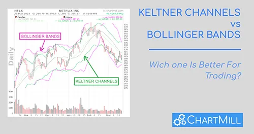
Keltner Channels vs Bollinger Bands: Which One Is Better For Trading?
In this article, we will explore the similarities and differences between Keltner Channels and Bollinger Bands and help you decide which indicator may be better suited for your trading style.

Support and Resistance Indicators Which One to Choose?
There is no one best support and resistance indicator, but combining several technical indicators provides more confidence. Moving averages, Bollinger Bands, Fibonacci retracements, and pivot points can serve as dynamic support and resistance zones. Relative Strength Index (RSI) can be used as a confirmation signal.

Best Indicators For Swing Trading Stocks | Enhance Your Swing Trading Setups.
Discover the best indicators for swing trading. Enhance your setups, maximize profits, and seize opportunities with effective strategies. Elevate your trading game today!
Exploring The Best Moving Averages For Swing Trading Success
The Best Moving Averages for Swing Trading. Learn how to combine short-term and long-term MAs for successful trades in this comprehensive guide.

Simple vs Exponential Moving Average: Unveiling the Best Choice for Investment and Trading Strategies
"Demystifying Simple vs Exponential Moving Average: How combining both enhances your trading strategy for optimal results.

Using The 200 Simple Moving Average - 200 SMA
The 200 SMA is used by both technical and fundamental investors to obtain insight into the long-term price trend of a stock/etf/index....
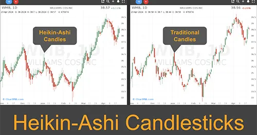
Swing Trading with Heikin Ashi: Trend Recognition and Trading Strategy
In this article you will learn the main differences between regular and Heikin Ashi candlesticks, why the latter are great for trend recognition and how to use them in a trading strategy.
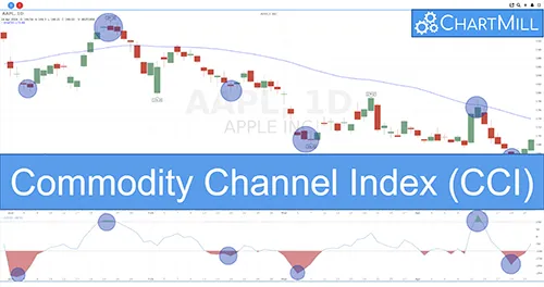
Mastering Market Momentum: The Commodity Channel Index (CCI)
The Commodity Channel Index (CCI) is a versatile momentum-based technical indicator used to measure the variation of a financial instrument's price from its statistical mean. It helps traders identify overbought or oversold conditions in the market.
Candlestick Patterns

The Bullish Engulfing Pattern: A Powerfull Candlestick Pattern For Trend Reversal Trading
The Bullish Engulfing Pattern is a powerful candlestick pattern for trend reversal trading. Learn how this pattern forms, how to recognize it, and how to use it in a profitable trading strategy.
The Bearish Engulfing Pattern | Definition
Understanding the Bearish Engulfing Pattern
The Bullish Harami Pattern | Definition, Interpretation and Trading Strategy
The Bullish Harami pattern is formed by two candles. The first candle is a negative (bearish) candle where shortly after the opening the price falls and by the end of the trading day, it closes near the daily low. As a result, a fairly long body is visible, as a sign of a clear negative trend.
The Bearish Harami Pattern | Definition
A bearish harami is a pattern that indicates a top when it is preceded by a price increase. It is a two-candle bearish reversal pattern.
The Bullish Hammer Candlestick Pattern | Definition
The bullish hammer pattern is a candlestick pattern in technical analysis that proves especially useful in active swing trading strategies in which the pattern is used as a warning signal that an existing bearish trend could reverse.
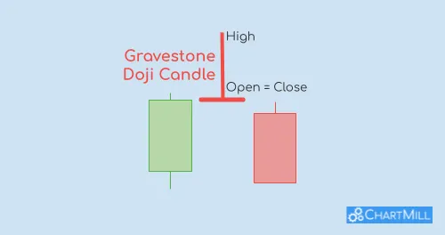
Understanding the Gravestone Doji: A Bearish Reversal Warning Signal in Trading
The gravestone doji candle pattern is considered a bearish reversal signal in a bullish trend. The candle is characterized by a significant upper shadow but the open, low and closing price are ultimately very close together. This indicates investor doubt about the prevailing trend.
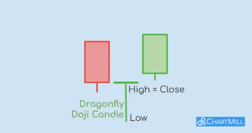
The Dragonfly Doji: a Candlestick Pattern to Recognize New Bullish Trends in an Early Stage.
The dragonfly doji is a Japanese candlestick pattern consisting of only one candle. It is used to identify reversal patterns after a bearish price trend.
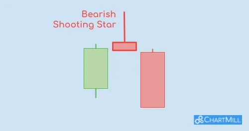
The Shooting Star Candle in Stock Trading
A shooting star candle is characterized by a small real body located at the lower end of the candle, with a long upper shadow and little to no lower shadow.
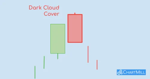
Understanding the Dark Cloud Cover Pattern in Trading
It's a candlestick pattern that forms when a bullish trend is about to come to an end and a trend reversal is imminent. The pattern consists of two candlesticks, with the first being a long bullish candlestick (white or green) and the second being a long bearish candlestick (black or red).
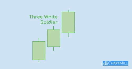
Three White Soldiers Candlestick Pattern: Unveiling the Power of this Bullish Reversal Pattern
The Three White Soldiers pattern occurs when three consecutive strong bullish candlesticks form after a downtrend, indicating that the market sentiment has shifted from bearish to bullish.
Chart Patterns
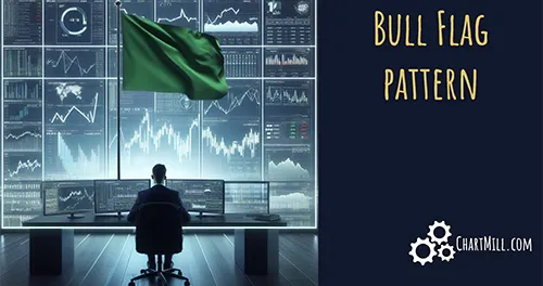
Bull Flag Chart Pattern Explained
A bull flag pattern is a continuation pattern and they frequently occur in stocks that are in a strong uptrend. Because the strong uptrend is almost vertical, it resembles a pole. The sideways price movement that follows has similarities to a flag, hence the name bullish flag formation.
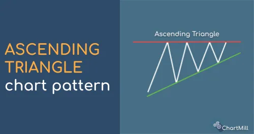
Ascending Triangle Pattern | What is it? How to trade it?
An ascending triangle is a bullish continuation chart pattern that forms when there is a strong upward trend in the price of an asset. It is characterized by a series of higher lows and a horizontal resistance area.
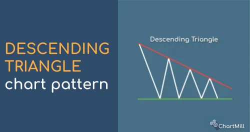
Descending Triangle Pattern
A Descending Triangle is formed by drawing a horizontal line that connects a series of lower highs and a descending trendline that connects a series of equal or slightly lower lows.
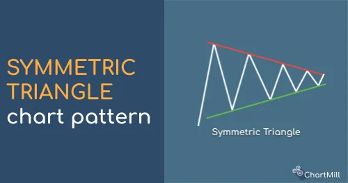
Symmetrical Triangle Secrets: Enhancing Your Trading with Chart Patterns.
A symmetrical triangle is formed by drawing two converging trendlines, with the upper trendline connecting the series of lower highs and the lower trendline connecting the series of higher lows.
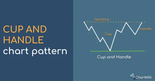
Cup and Handle Pattern
The cup and handle chart pattern is one of many classic chart patterns within technical analysis. The pattern literally has the shape of a 'cup with handle', hence the name.
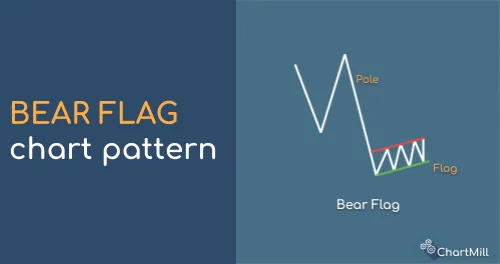
Bear Flags (and pennants) | Definition
Bear Flags and Pennants are powerful chart patterns in technical analysis. The are called 'continuation patterns' as the flag embeds prices that are consolidating in a range after a strong move down.
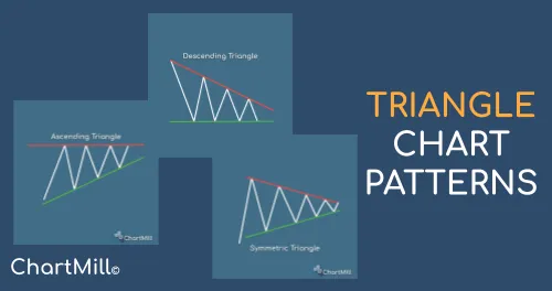
Triangle Chart Patterns
Triangle patterns are well-known chart patterns within the field of technical analysis. They exist in different formations, bullish, bearish or symmetrical.
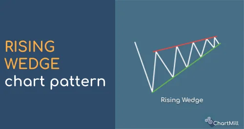
Rising Wedge Pattern
A rising wedge is a chart pattern characterized by two rising trend lines running in the same direction but with different slopes. The lower trend line is steeper than the upper trend line which in itself is a sign that buyers are moving increasingly faster into the market during intermediate price dips.
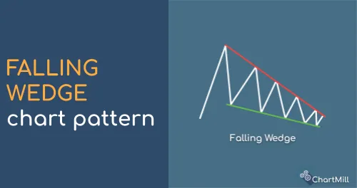
Falling Wedge Pattern
A falling wedge has two descending trend lines. Both trend lines run in the same direction but each has a different slope.
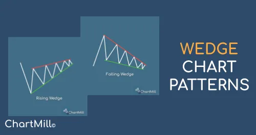
Wedge chart patterns
Wedge patterns are considered reversal patterns within technical analysis. The wedge formation consists of a support and resistance line running in the same direction but with different slopes. The formation gradually narrows until eventually the lower or upper trend line is broken, leading to a buy or sell signal.
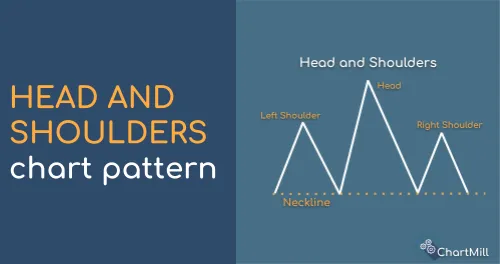
Head and Shoulders Pattern
The head and shoulders pattern is one of the most well-known technical patterns within the field of technical analysis. The pattern is characterized by the presence of 3 consecutive price tops with the middle top being the highest.
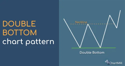
Double Bottom
A double bottom is a well-known chart pattern within technical analysis and is considered an early bullish reversal pattern. It indicates an imminent trend reversal after a downtrend.
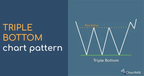
Triple Bottom
The triple bottom pattern is an extension of the double bottom pattern and is also cataloged as a bullish reversal pattern.
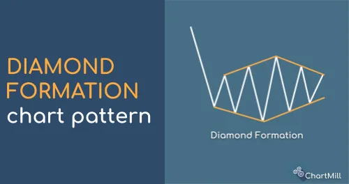
Diamond Formation
The diamond chart pattern is a technical pattern that can occur either at the end of a falling or rising trend. It is a powerful reversal pattern that - *unlike many other technical patterns* - can only be observed rather exceptionally.
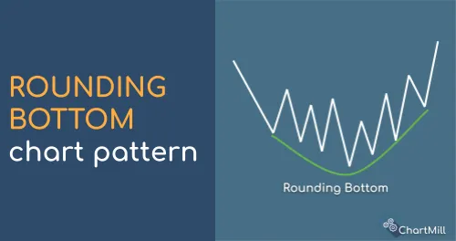
Rounding Bottom Pattern
The rounding bottom, also called a saucer bottom is a bullish reversal pattern within the field of technical analysis. The rounding bottom contains the absolute low and the pattern itself is the actual 'bottoming out'-process that takes at least weeks and sometimes even months.
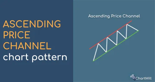
Ascending Price Channel
An ascending price channel is formed by two rising trend lines running parallel to each other. This creates the pattern of higher tops and higher bottoms, also called price swings.
Descending Price Channel
The descending price channel forms through a succession of lower tops and lower bottoms. When the respective tops and bottoms are connected, two descending trend lines parallel to each other are created.
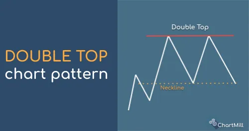
Double Top
A double top is a bearish reversal pattern and is thus the counterpart of the double bottom pattern. The pattern is a first tentative indication that the current bullish trend is coming to an end and the chances of a bearish trend change are present.
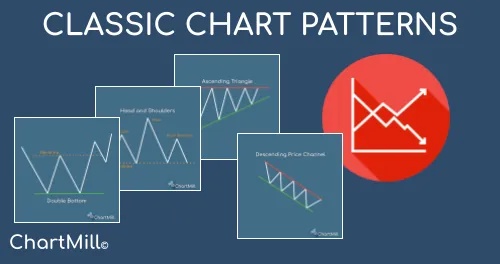
Classic Chart Patterns
Chart patterns are a common tool used by traders to identify potential trading opportunities in the financial markets. These patterns are formed by the price action of a security, and can provide valuable information about the direction in which the price is likely to move.
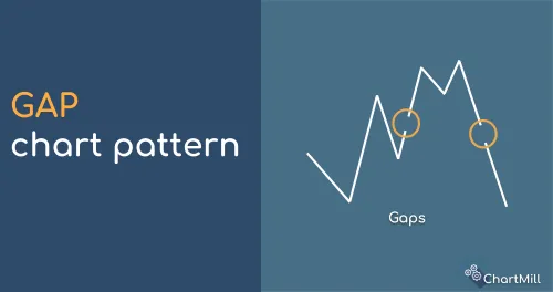
Stock gapping
A gap is a break in the price chart of a security, which occurs when the price of a security suddenly rises or falls sharply, causing certain price levels to be skipped so that no trading takes place at those levels.

Stock Market Golden Cross
The Stock Market Golden Cross occurs when the short-term moving average, crosses the long-term moving average upward, confirming a reversal in a downward trend.
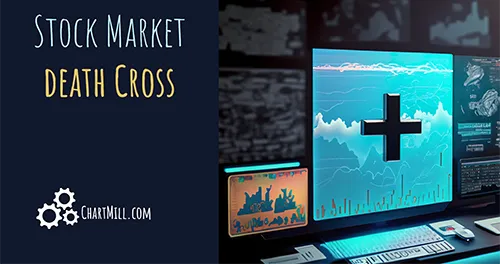
Death Cross Stocks Chart Pattern
The death cross stocks chart pattern forms when the short-term price average falls below the long-term price average. This is an indication that the prevailing bullish trend is no longer valid and changes to a bearish trend.
High Tight Flag Pattern
The high tight flag becomes visible after a sharp uptrend on high volume. Afterwards, the price - as with the regular bull flag - moves into a sideways range for a short period of time. The price consolidates and the volume decreases significantly. Once the price breaks out above the flag pattern again, one can assume a continuation of the existing bullish trend.