TRADERS - Equity Curve Control - Part 2
Published on Chartmill with kind permission of TRADERS’ Magazine. Check the original PDF article here
Though technical analysis thrives on the premise that price and volume are the ultimate synthesis of all market information digested by all market participants, it is equally important for a trader to see the bigger picture of his performance in the long run. Handling each trade right is of course very important. But the weight of each trade on performance diminishes the more trades are taken. This article series eventually goes beyond evaluating that performance and shows how it even can be controlled to a certain degree, by focusing on that bigger picture.
Every person or institution trading, or investing in, financial markets, uses a system. Or even many different systems. Some systems are totally automated. Others are almost fully discretionary. In which case we’d rather call it a strategy (what’s in a name †). Some people wouldn’t even be able to begin describing their system, when asked. But even someone just chasing hot stock tips, actually is using a system.
Some put heavy weight on up front analysis of the system they use, or are about to use. Putting in a lot of intelligence, rules and adaptability. Going as far as optimizing parameters, while backtesting and fine-tuning them before putting them to the final test of forward testing. Others don’t even have a clue what system they are using, as they might well be switching around different systems without even knowing. Then again, mixing systems is, again, a system on its own.
Every system uses input, usually based on some form of analysis of raw data, fundamental and/or technical, to produce output in the form of when to buy or sell how much of whatever financial product, that is, to produce orders.
† In this article system is also used as a synonym for strategy. The whole of decisions used and/or necessary to actually trade.
Expectancy
In the previous article of this series, we spent quite some time discussing system dynamics and how all of this relates to financial markets as dynamic systems. Figure 1 shows our system model of financial markets, with an internal feedback loop pointing out the fact that prices are partly caused by behavior, which in turn get influenced by prices, and so on. The main point distilled out of all this, was that we cannot make any changes to a system without creating a different system. Hence we cannot change a system’s internals while tuning it’s performance without curve fitting it into something that might not be robust any longer, if it ever was in the first place. With this, the question arises as to how we can assure system stability or robustness.
Another major possible source of looking the wrong way at building and using a system, comes from the supposed necessity of a positive expectancy, often plainly called an edge. Is a positive expectancy, of course it always being the expectancy based on past performance, a good indicator of a good system? Chances are, it is. At least, if the positive expectancy is established over a long enough period, preferably containing all market types (bear, bull, volatile). However, one can never know if that expectancy is a coincidence, due to tampering with the system and its rules, while testing its historical performance. So, the longer we look back and the less we change the system, the better an indicator to a profitable system, expectancy might be. The bad news is it is very hard to obtain an positive expectancy the first time around when defining a system. Almost always, systems get ‘changed’ to meet obedience to historical positive expectancy in search for an edge.
What’s more, the longer a period we look back, the more possible a positive edge becomes, but the smaller it probably will be.
So what if we turn these questions around? Is it necessary for a usable system to have an edge? Can we measure a systems true expectancy? Is the historical expectancy of any use?
Should we dismiss a system with a negative expectancy? Perhaps not. For one thing, a system can have an totally different expectancy at different times or in different timeframes, while being in or out of synch with the market at any given time. Of course every system making money will surely have had a positive expectancy, in retro sight. We will however never know it in advance. Put another way, we will never know future expectancy. Trying to do so, or acting like we can, substituting an incalculable future expectancy by its historical counterpart, will only lead us to underestimating risk.
Expectancy is probably overrated as Ralph Vince already showed us that a system with positive expectancy can be augmented (i.e. improved) by joining it at the right moment with the right system having a negative expectancy.
To worsen things, a lot of the people who are into backtesting and measuring expectancy, are basing their calculations on system returns being distributed normally. But they aren’t, if we don’t want to be blind to practically every shred of empirical evidence we can lay our hands on. So before everything else, those people adhering to the wisdom of an edge, should at least stop using normal distributions and start taking into consideration fat (or long) tails, moving toward a theoretical Taleb distribution.
So to wrap things up a bit. The more we try to fit a system to past data, the less robust it will get. The more it is fit, the sooner it will break and the more of its time it will be out of synch with the markets being traded. With more complex rules or even just a higher number of rules we narrow down definition of favorable market activity for our system. The narrower favorable action is defined, the harder it will be met at any time. Hence the less time our system will be in synch with the market. We can call a system that’s mostly out of sync, dead or useless, for that matter. Even though it could have a positive expectancy (which, again, we will never know before trading it), it would be very very hard to trade such a system from a mental or psychological viewpoint. The more basic it’s rules are, the less we need the guarantee of an edge over some arbitrarily chosen interval. In fact, the less the need for backtesting exists at all, leaving more energy to forward testing our system, while putting more focus on risk management and position sizing.
Of course forward testing implies measuring what’s going on. Although we might not know the expectancy of a system at any time in the future, we should at least measure the system being traded to know it is (currently) working. What better way to know that it is work, than by looking at its performance.
Equity Curve Analysis
The equity curve of a system shows us how its equity is, or assets under management are, evolving. It will go up if the system is working, that is if it’s in synch with the market, or down otherwise.
An equity curve, like the one in figure 2, shows us what happens with our money as it is being used by some investment system. At each moment in time it gives the value of each dollar initially put at stake with the system. Of course one could display the value of an initial investment of $100 or $1000. The chart would be the same. Only the Y-axis would change. For ease of calculation and comparison, we usually take a rounded number. Unless costs (commission and taxes) are taking into account, the initial number doesn’t matter that much. When costs are taken into account though, it is necessary to start from the actual initial value of the portfolio.
An equity curve is ideal for providing a (quick) analysis of how a strategy has performed both in terms of return as well as risk (drawdowns and volatility). A lot of metrics are already defined to this end, such as Maximum Adverse Excursion (MAE) and Maximum Favorable Excursion (MFE), just to name a few. Also, multiple equity curves can be used to compare various trading strategies.
Everything in your typical technical analysis arsenal can be used on an equity curve as well. Trend lines, moving averages, average true range, …
And even more can be added that would be useless in classical technical analysis, such as dollar days invested (°), open risk or the distance between its current value and the value it would have if every position was stopped out at its respective current stop level.
But this seemingly boring statistic of our running equity, has a lot more in store than merely measuring performance. Take, for instance, the concept of streaks. There has been (an probably will be) written a lot on the correlation of winners and losers. A streak refers to the clustering of winners or losers. But perhaps the wrong question gets asked. It’s not so much a question of whether the occurrence of streaks is a random fluke or has a causal explanation. Instead we should aim for streaks, just because they point towards a high correlation of winners and losers. And that might be to most reliable sign of a robust system, as it indicates the exact in/out of synch cycle we are looking for. So the steadier (i.e. the longer) streaks are, the more reliable the system may be in those times where it’s in synch with the market. If winners and losers are randomly intermingled the system is probably far less robust and probably will show no edge at all or a far smaller edge with no guarantees for the future. A high streak system will probably show us clearer signs when it goes in or out of synch with the marke,t through the emergence of streaks and those streaks being cut off. Put another way, the presence of streaks will translate itself into clear trends of the equity curve, signing a more stable system.
As this article series isn’t merely aiming at analyzing an equity curve, but wants to take this one step further, that is using the equity curve to drive a systems behavior, please do not consider this article as an attempt to be complete as to everything there is to say about equity curve analysis. There is a lot of material available out there though, to fill up this space. Besides it would be beyond of the scope of this article series, trying to give a full coverage of the matter at hand (i.e. the analysis possibilities of an equity curve).
For now it suffices that the reader understands what an equity curve is and that it can be analyzed using all our tools we take stock charts and technical analysis on with.
(°) How many days a dollar was invested over a certain period.
Conclusion
The simplest of systems, in terms of rules, can be the most robust overall. The in/out of cycle we are looking for as a sign of system robustness might well be spotted effectively by studying streaks, instead of, for instance, only temporarily measured historical expectancy.
Since such a system gives clear signals of going in and out of synch with the market, a forward test is far less expensive and pretty safe to implement. To do just that, we have to get our system out of the market when it starts going out of synch only to put it right back in when synchronized times reappear.
Next time …
… we’ll explain how equity curve analysis can be used to improve a systems performance without tinkering with the internals and rules of the system itself. We also will study an example of how such an idea can be implemented and finally we’ll take on some critical thinking on the matter.
[FIGURE 1]
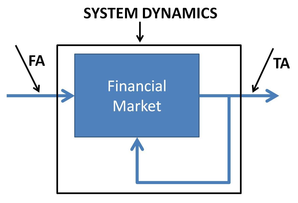
[HEAD] Financial Markets System Dynamics
[CAPTION] Figure 1: To cope with the internal feedback loop, where the output (prices) influence the system, we have to include the feedback loop into our definition of the system (black box), as we do not exactly know the exact impact of this feedback in relation to the system output.
[FIGURE 2]
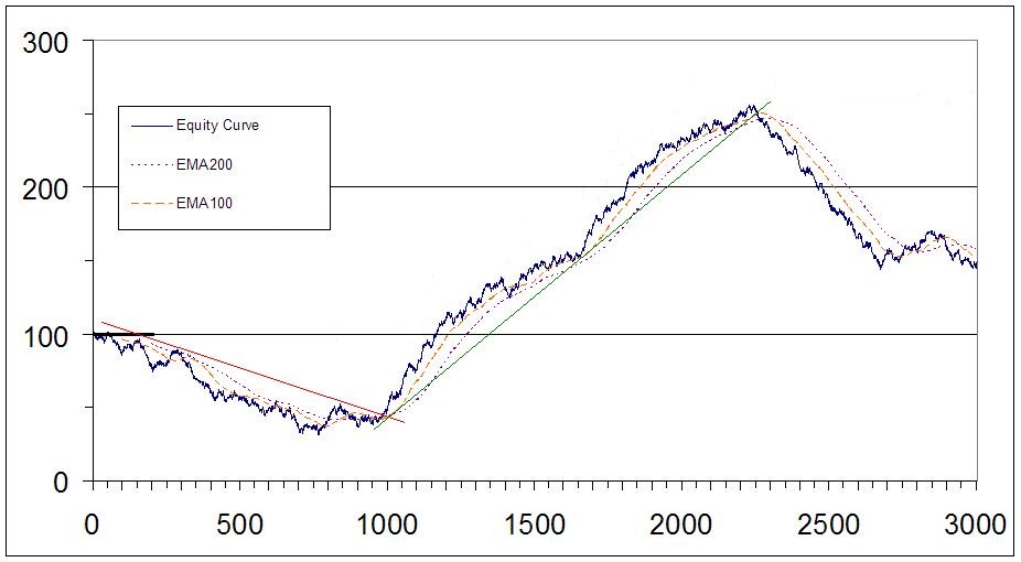
[HEAD] Actual equity curve Analysis and control of a real trading system.
[CAPTION] Figure 2: Equity curve van a trend following trading system through changing market environments. Both trend lines and moving averages are shown on the chart. Moving averages being slightly better candidates for algorithmic implementation (software). The charts also how the clear presence of streaks translate into trends in the equity curve.
DIRK VANDYCKE is actively and independently studying the markets for over 15 year, with a focus on technical analysis, market dynamics and behavioral finance. He writes articles on a regular basis and develops software partly available at his website www.chartmill.com. Holding master degrees in both Electronics Engineering and Computer Science, he teaches software development and statistics at a Belgian University. He’s also an avid reader of anything he can get his hands on. He can be reached at dirk@monest.net.