
TRADERS – Chartmill Bull and Bear Indicator (Part 1)
Published on Chartmill with kind permission of TRADERS’ Magazine. Check the original PDF article here
Divergency isn’t by long a new focal point of technical analysts anymore. The deviating behavior between different aspects, indicators if you will, in a certain analysis can point the way to trend changes being imminent. As always the biggest problem in technical analysis, which is all about measuring probabilities rather than forecasting a certain future, is the quantification of concepts like this. Most attempts get stuck in an algorithmic approach trying to capture certain graphical setups, resulting in mediocre results at best. This article series will try to provide a statistical framework, which resulted in a particular indicator.
Apart from the use of derivatives perhaps, the only way to make money in the markets is by a difference between the price at which a position was opened an the price at which it was closed. Buying not necessarily needing to come first, as it is by the selling first that short positions are initiated. It is every technical analyst’s wildest dream to be able to predict price moves. As that is impossible, the next best thing is try to find high probability setups and handle them with correct position sizes and the right aptitude for risk management. One way to find high probability setups has always been by looking for what’s called divergences.
Expansion and contraction
Before we start to look at divergences, we have to realize that they are closely connected with the contraction and expansion of market prices. Ever noticed price ranges contract before the expand? Any technical analyst being around for even just a few months, probably did. I call this the tsunami effect, referring to how a sea recedes prior to all hell breaking loose by the devastating tidal wave that follows. In the same way, volatility and daily range seems to shrink before a stock starts running, thereby sucking all liquidity out of a market. Tsunami’s, however, are far more rare than price expansion and often subsequent trends. So can we detect a tsunami before it floods us?
Any good divergence indicator therefore will need to monitor contraction as a precursor to expansion. For it is in the contraction prior to an expansion that will lead us to detect the price movement to be.
A Good Divergent Look at Divergence
Divergence mostly is looked for in two ways. First there’s the graphical way in which an analyst looks for price, volume or any indicator to put down higher or lower tops or bottoms, while another indicator, volume or price does the exact opposite. For a very easy example, price going to a new high while volume declines, is considered a negative divergence. In reality, primarily indicators are compared with price to spot divergences, though. In the same way, when price takes out a previous low, while an oscillator at the same time shows a higher bottom, this is generally considered bullish and called a positive divergence. This brings us to the second divergence detection, that is, by building yet another indicator, typically an oscillator, that brings with it the promise to measure divergence in its own right, not needing to compare two different time series. Most of the time this is actually done by basically subtracting two different time series. That way, the difference will grow in the case of a negative divergence and shrink in the case of a positive divergence. All kind of tricks are than applied to this difference, like mirroring it around its x-axis to show increase in the case of ‘positive’ divergence, and decrease with negative divergences.
Of course there’s a lot wrong with merely aiming for the difference between two time series. For one thing, both can go higher, but one of them can go higher more quickly. That way the difference would increase as well.
Secondly, this points to the fact that divergence and correlation are two totally different things altogether. Measuring one well doesn’t necessarily imply measuring the other in a correct fashion.
For a third matter, though a minor issue, there’s something odd with how a divergence is called a positive or negative one. It instills a directional dimension that doesn’t necessarily has to exist. Why should a divergence be either good or bad? Of course it will always be so from the viewpoint of one’s position. But no one indicator can do both. So we could have an indicator for bull signals, but then we should have another one for the bear signals. This means there should be a pair of indicators, not just one.
Forth and biggest problem with the ‘classical’ solutions is that they aim to measure what I will call ‘extrinsic’ divergences. With extrinsic divergences I’m trying to capture the fact that the divergence actually takes place between two, possible totally different, time series. All in all, extrinsic divergences, popular as they may be, show slender reliability. Though that may well be more because of the way we are trying to quantify them than it is due to their very nature of being ‘between’ two time series. But also people tend to ‘look’ for divergences, implying they are already in progress as we start seeing them. That’s probably why extrinsic divergences are so popular. In comparison to extrinsic divergence, very few research seems to be (and have been) done towards intrinsic divergence. Intrinsic divergence pointing to divergence of time series with itself, when looking to it from the time dimension. Out of this articles scope but equally under researched is the frequency analysis of time series and intrinsic divergence in the frequency spectrum. In this article series we’re going to stick to intrinsic time divergence.
Last but not least, there’s the everlasting problems of indicators needing parameters that are then, to worsen things, need to be hardwired with their usage in systems. We need adaptive, parameter-less and hence totally objective indicators. That’s one of the main efforts put in to our ChartMill indicators, the ChartMill Bull/Bear being one (pair) of them.
Ra(n)ging Bull
I f we want to detect deviating behavior under the hood, looking at intraday behavior, we have to start by asking what normal behavior is and how we can quantify it. Contraction springs from a lack of interest (volume) and the accompanying shrinking of daily range (volatility). Expansion is characterized by increasing volumes but even more so perhaps by the surge in daily range due to illiquidity. Consensus, at that moment, about future value deviates far from current price, resulting in the start of an outbreak and the ignition of a possible new trend or the firing up of an existing one during consolidation. Keep aware in what follows, however, that volatility can increase or decrease while prices do trend. Exactly one of the problems described above with most solutions to the problem of detecting divergence.
Even though there are lots of ways to quantify volatility over a certain period Bollinger Bands go back to the roots of statistics, using the standard deviation of log returns. They are however somewhat expensive to calculate and with them comes the danger of thinking that log returns display a normal (i.e. Gaussian) distribution, which is definitely not the case. Another quite nice solution is the NRx signal, describing the narrowest range over x periods. Signals like these are closely related to inside days and so on.
Here we are going to use what is probably the simplest way to measure volatility, the true range over a certain period. This basically is the range of that period but adjusted for gaps. We will define it however a bit differently, because we need a few intermediate numbers (the end number will be the same, nevertheless). The true range is the difference between the true high and the true low. The true high in turn, being the highest of either the high of the period or the previous period’s close (which will be higher in the case of a gap down). The true low, likewise, is defined as the lowest of either the period’s low or the previous period’s close (which will be lower in the case of a gap up). So we add to the periods range any gaps that would happen to be taken from the previous period’s close.
Volatility than can be quantified as the moving average true range or ATR over a certain number of periods (typically 20).
At first glance, this ATR’s momentum, measured as the difference between the ATR at two distinct moments, would seem to be a nice candidate for measuring contraction. But there’s more.
Future Expansion and True Divergence
We’re not interested in seeing the divergence by its consequence, that is expansion. We actually want to spot divergences before they materialize into price runs or drops. Trading is about catching a window of opportunity seasoned with probabilities, before it becomes clear to anyone what is happening and the window is closed. To that end we want to and look for cumulating intra period divergences. Since it’s impossible to develop the whole idea into this article, we start off by looking at some curious facts about trending days.
It seems that trending days, days where there’s a lot of conviction in one direction, there’s a strong correlation with the urge to expand and where the period closes of in the range. This is not a new idea. Oscillators like stochastics and other indicators like accumulation/distribution line, as well as several authors use some kind of principle of measuring where the close is situated in a period’s range. We’ll define our ‘relative close location’ value (RCL) as:
This number will be 1 in the case of a close at the high and the absence of a gap down. If the period closes at its low, the RCL will be 0. Notice the fact that, contrary to almost every source out there, we use true high and low instead of the mere low and high.
Therefore, we look for an indication/divergence before the expansion takes place. We find this divergence in the abnormal behavior of the normally strong correlation between trend days, the expansion tendency and the close location value (CLV). Indeed, it is the case that during trend days, peculiar to expansion, the price has a pronounced tendency to close near the maximum (or the minimum, depending on the direction of expansion).
Furthermore we’ll define the ‘expansive urge’ value (EU) of a period as:
This key performance for a period looks at what fraction of a periods true range was in fact bridged between its open and its close. Again, look at extreme values to understand this metric. If a stock’s period opens at the true low and closes at the true high, the EU will be one (at least if there was no opening gap left open by the close). If, instead, a stock opens at the the true high and closes at the true low, the period’s EU will be -1.
Now take a look at figure 1, where we made a XY-chart for a random set of stocks. On the X-axis each period’s return at the close against the previous period is used. On the Y-axis, we off the point at their EU value. So each point on the plot represents a period, given by its day-to-day return and its expansive urge. We only withheld the periods of those stocks accounting for more than 5% return on that periods, or less than -5%, though. So we kind of wiped clean the plot vertically in the X-interval [-5%, +5%]. The strange thing is that with it, all point between -0.30 and +0,30 seem to have disappeared ON THE Y-axis, as well. So on strong trending days, the close tends to be near that extreme of the period that’s located at the same side as where the move was going. For instance, on any day raking in more than 5%, the close tends to be at the period’s true high. So is it possible that EU is an indicator of trending days, next to high returns and, with it, correlated with the RCL value?
Figure 2 shows it is. In this chart, the same periods are scattered by their EU value on the X-axis and their RCL value on the Y-axis. Once again mostly the upper right and lower left corner of the graph is populated by points. So the RCL tends towards 1 as the EU moves to 1, while it moves over to 0 when the EU is near -1. This generally means that high trending (expansive) days tend to close at the period’s extreme at the end to where the trend points. This is the true high for a strong up day and the true low for a strong down day. In the next article we’re going to look at a moving window, looking for such expansive days and count those which are ‘not normal’ or diverge from what we normally could expect, to arrive at truly intrinsic divergence. Stay tuned!
References: High Probability Trading by Marcel Link and Long/Short Market Dynamics by Clive M. Corcoran.
[FIGURE 1]
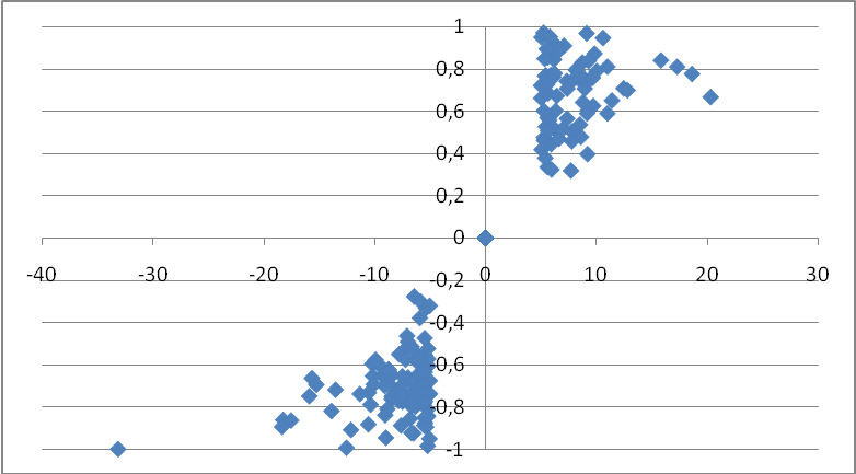
[HEAD] Expansive urge on trending days
[CAPTION] Figure 1: Scatterplot of high return days on random stocks in function of their expansive urge. It seems both measures are closely related. Strong percentage gains/losses correlate with high/low expansive urge.
[FIGURE 2]
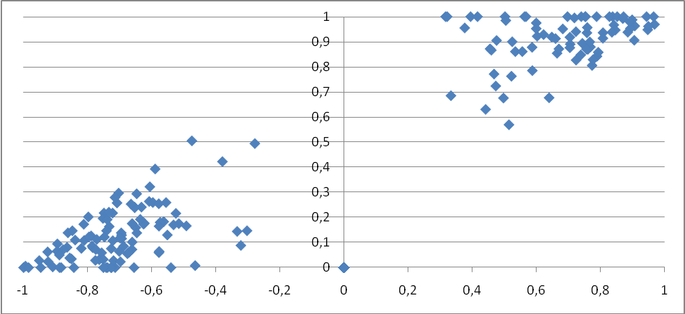
[HEAD] Stocks tend to close near extremes on high trending days
[CAPTION] Figure 2: RCL value scattered with EU value for random stocks. Only high return periods were plotted. It’s clear from the chart that stocks tend to close at their high/low on expansive periods at the end directed by the trend for that period.
DIRK VANDYCKE is actively and independently studying the markets since 1995 with a focus on technical analysis, market dynamics and behavioral finance. He writes articles on a regular basis and develops software partly available at his co-owned website www.chartmill.com. Holding master degrees in both Electronics Engineering and Computer Science, he teaches software development and statistics at a Belgian University. He’s also an avid reader of anything he can get his hands on. He can be reached at dirk@monest.net.