
TRADERS - Chartmill Bull and Bear Indicator (Part 3)
Published on Chartmill with kind permission of TRADERS’ Magazine. Check the original PDF article here
Divergency isn’t by long a new focal point of technical analysts anymore. The deviating behavior between different aspects, indicators if you will, in a certain analysis can point the way to trend changes being imminent. As always the biggest problem in technical analysis, which is all about measuring probabilities rather than forecasting a certain future, is the quantification of concepts like this. Most attempts get stuck in an algorithmic approach trying to capture certain graphical setups, resulting in mediocre results at best. This article series will try to provide a statistical framework, which resulted in a particular indicator.
This series of three articles took off by explaining the difference between extrinsic and intrinsic divergence. In the former, the divergence between different time series is measured by their distance to each other. A common practice in technical analysis. The latter is far less, if altogether, popular and tries to x-ray a time series for inherent divergence within its own data. This kind of divergence of course needs an intrinsic correlation inside the time series. This correlation was found in the fact that extreme percentage days tend to close near their extremes in the direction of the move. Any divergence from this could be written down as rare. By calculating a running sum of this kind of divergences, which tend to cluster, the Chartmill Bull and Bear indicators came to live. As an aside, these indicators make use of first and fourth quartiles rather than averages to measure ‘rare’. Any event where a move is within the 25% most extreme moves of the recent past in either the up or down direction but where the close was in the 25% least extreme closes in that same recent past, respectively near the low or high, was marked as a divergence from what could be called ‘normal’. So the indicators try to capture the clustering of extreme moving days closing on the ‘wrong’ side of the range. Since both indicators use running percentiles, high and low are not absolute or percentage values, but relative ones, giving these indicators the dynamic and adaptive characteristic that most other known divergence measures lack.
In the previous articles we saw the details of how these indicators are built and differ from almost all known, and primarily extrinsic, divergence techniques. We also saw some general examples. In this final article we zoom in on practical usage of the indicators as shown by the first, be it preliminary, back tests. We’ll also discuss estimating the quality of these indicators’ signals in a broader context, by deducing them from their definition.
First things first
As you might remember from the earlier articles, in normal circumstances, very weak days (with large price drops) also tend to have very weak closes (near the low of the day). Likewise, very strong days (with big price appreciation) tend to see their appearance correlated with the presence of very strong closes (near the high of that day). So the first thing to know about the Chartmill Bull and Bear Indicators is that they give better signals with bigger price variation. As a consequence they happen to give better results in the presence of increased volatility. Increased volatility, that is, as compared to the most recent volatility. They also seem to give slightly better signals in higher timeframes, but only given the above preconditions. So be careful not to generalize this to ‘higher timeframes give better signals’.
What’s more, reliability of signals tend to cluster around certain equities. This implicates that signals get more reliable when earlier signals on the same equity already proofed to be more reliable.
Finally, these bull and bear indicators can be used to pinpoint extremes as well as reversals. The stronger an existing trend the more reliable countertrend signals become in forecasting a, perhaps only temporarily, reversal.
Even though most traders would call this a wished for feature, be advised that signals can come early. So it’s better to enter after these signals with a trailing entry stop order than with market orders.
To reverse or not?
One of the major goals of divergence techniques in the technical analysis of equities is, of course, anticipating tops and bottoms. There is, however, a subtle but big difference in knowing when a price extreme is being created and seeing any sign of a reversal following through. Nevertheless it doesn’t have to mean that divergence is necessarily about countertrend trading as the example in figure 1 proofs. This, by the way, happens to be one of the most successful ways of using this set of Chartmill indicators. Let’s take a look at the scenario in figure 1. What we have there is a long term daily chart of the Apple, Inc. stock going back over a period of about two years (not the past two years). First thing to notice is that there were only three bullish signals and all of time came just in time to announce the strongest progressions on the chart (in price per time terms). The first signal caught our attention around the end of 2010 August at the bottom of a dip after a sideways period. Bottoms being exactly one of the places where divergences pop up this gave way to about a 50% price increase over the next six months. What this illustrates is the fact that the best divergences to look for might be at the end of horizontal phases. In this case the horizontal accumulations stage that came after a down trend nurtured the divergence showing up in what we could call the last shakeout. Throwing in the towel at a time were a bullish divergence showed changing dynamics wasn’t that good an idea. It was clearly a time to buy. The third signal on that same chart is highly comparable as it also came at the bottom of a dip after a sideways stage. With two exceptions, however. First of all, this horizontal stage showed higher volatility and came after a uptrend, which increases the probability of being in a distribution or topping stage. So any bullish divergence signals would have to be seen as a continuation pattern which, if followed through by new highs, is a very high probability low risk setup. Up legs tend to be more aggressive and cover a greater price distance later on in an uptrend. Secondly, this signal can clearly be framed inside an existing up trend on a longer time frame, which is proof that the strongest divergence signals can actually be continuation patterns. Trading this signal would have yielded a whopping 70% profit. Of course there’s a catch to a later staged signal. If one buys anticipating a new breakout, it doesn’t have to materialize. Possible isn’t probable. The way to deal with this is pure technical by translating the anticipation into a trailing entry stop order as soon as the signal shows up on the chart. The actual position than is only opened upon the signal materializing in a real breakout. As an aside, also notice the first and third signal emerging at the 200 day simple moving average. The second signal is also a continuation one, but more suspicious. But as long we, again, don’t react on merely a signal by entering but only anticipate by means of placing a trailing entry stop order, each divergence signal in the direction of the major trend is innocent until proven guilty. This is actually where the true potential of intrinsic divergences can get fully appreciated. There was no other way of expecting a new up stage. In fact, the price chart already started showing lower highs and lower bottoms. So the rational thing to do would have been to cut losses going into the dip just after the second signal. By just placing a new trailing buy entry stop order, would one not only have dodged temporary loss but even gotten a better entry price just before take-off. Without the intrinsic divergence signalled by the Chartmill bull indicator this great opportunity would have been missed out on. Note that the second signal didn’t come timely but rather somehow to early. This is the price we pay for having a leading instead of a lagging indicator and the reason why we have to play these setups by trailing with entry orders. A good trade-off after all.
Countertrend trading
In a market environment where trend following seems to be very hard over several years, countertrend and range trading naturally gets more attention. Divergence detection is originally focussed on spotting tops and bottoms and, in the end, reversals. This can be done with our Chartmill divergence suite of indicators as well. In figure 2 the same AAPL chart is continued to the right with the first bullish divergence signal being the last one of the previous chart. Without going into all details here, the things to watch are the fact that in strong trends, counter trend signals, like the two bearish divergence signals in this case, get stretched, loosing most of their accuracy. Nevertheless, they put down their tops before the actual price does. Sometimes, as in the first bear signal, a top gets even more highlighted by the indicator by a double top showing in the indicator (look at the squared region). One final touch is the usage of a trending indicator to tax divergence signals. Here we used the proprietary Chartmill Trend indicator. Look at how all signals in this chart originated as counter trend signals, even though the first one is actually the continuation signal from the right shown in figure 1.
Wrap up
Even though usage of the divergence indicators were illustrated by way of a particular stock, back tests shows a statistical significant promise to using them in the ways described in this last article. Of course all back tests just show what would have happened in the past and no future expectancy can ever be known. But at least usage wasn’t deduced from just some examples. The examples were used to illustrate the back test.
Both indicators are freely available for charting and screening on Chartmill. Enjoy!
References: High Probability Trading by Marcel Link and Long/Short Market Dynamics by Clive M. Corcoran.
[FIGURE 1]
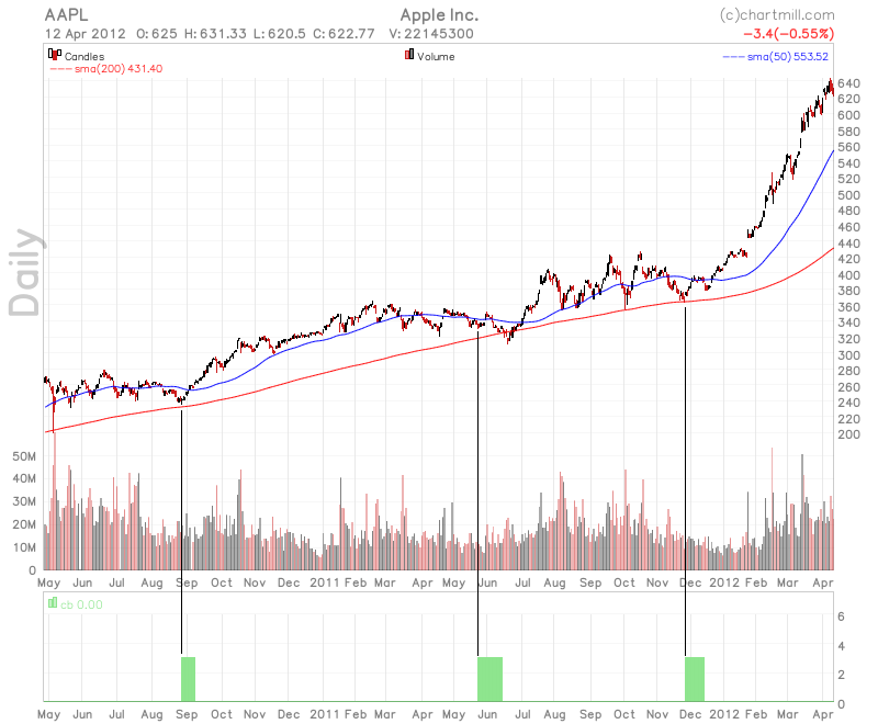
[HEAD] Timing and accuracy of Chartmill Bull/Bear
[CAPTION] Figure 1: This historic chart of Apple, Inc. (AAPL) shows how few but very nicely timed buy signals originated from the Chartmill Bull Indicator in a long term timeframe, the one in the middle being somewhat premature.
[FIGURE 2]
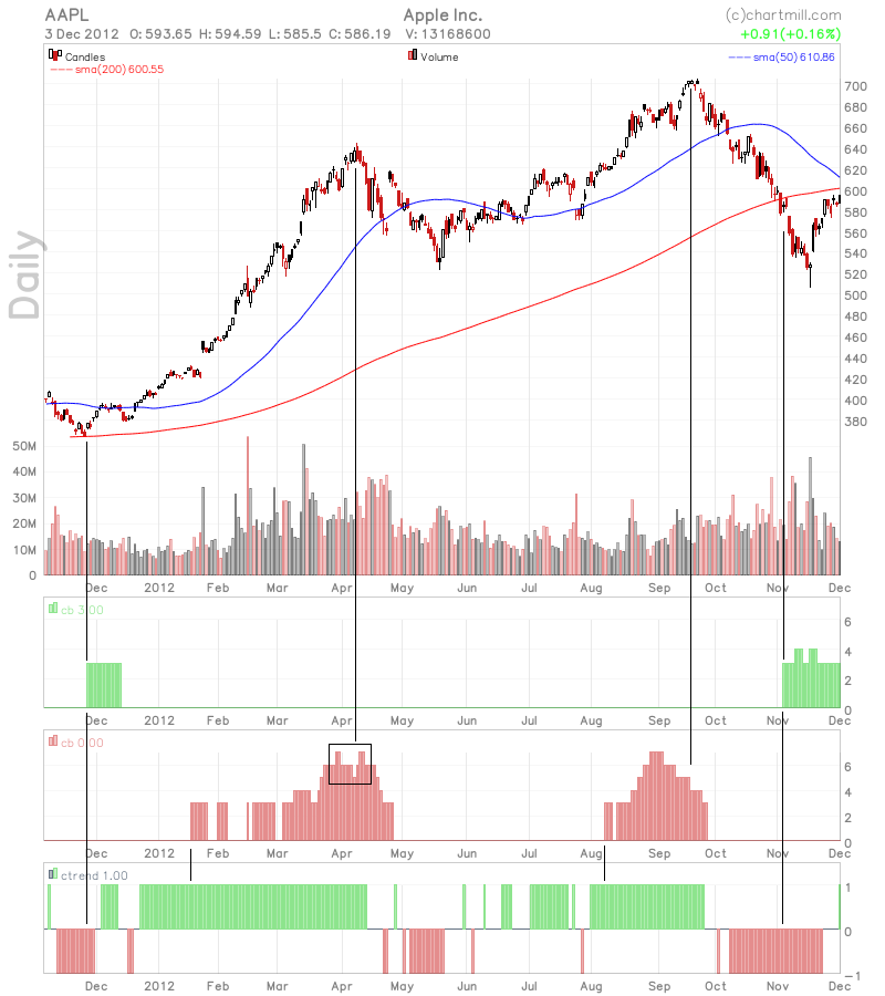
[HEAD] Integration of the Chartmill Bull/Bear and Chartmill Trend indicator
[CAPTION] Figure 2: This chart takes off where the figure 1 left us. This charts shows the importance of the interaction between the Chartmill Bull/Bear Indicator signalling divergence and any prevailing current trend.
DIRK VANDYCKE is actively and independently studying the markets since 1995 with a focus on technical analysis, market dynamics and behavioral finance. He writes articles on a regular basis and develops software partly available at his co-owned website www.chartmill.com. Holding master degrees in both Electronics Engineering and Computer Science, he teaches software development and statistics at a Belgian University. He’s also an avid reader of anything he can get his hands on. He can be reached at dirk@monest.net.