Three candlestick patterns heralding a trend reversal
Last update: Jun 6, 2022
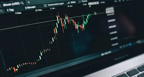
What are candlesticks?
Candlesticks are originally a Japanese analysis technique. As with more classical technical analysis, candlesticks are based on price data:
- Opening price
- Closing price
- Highest price
- Lowest price
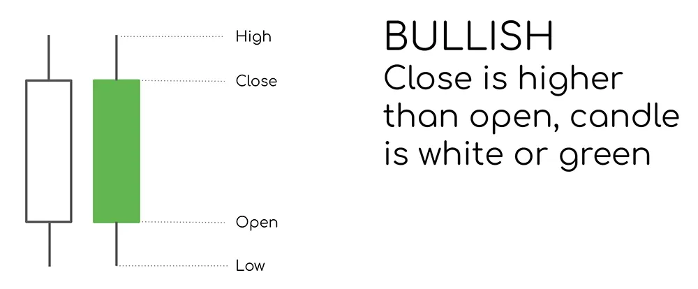
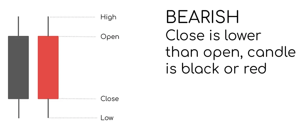
Depending on the closing price the color of the candlestick is white/green (closing higher) or black/red (closing lower). The colored part of the candlestick is the body. The vertical lines above and below the candlestick, which represent the highest and the lowest price, are the shadows. The longer the body and the shadow, the bigger the difference between the different values and consequently the higher the volatility.
Each candlestick represents one period. On a day chart a candle will represent one complete trading day, whereas on an hourly chart each candle represents the price information of one hour and on the weekly chart all price information of one week is bundled in the same candle.
Due to the combination of color, shape and length, a candlestick contains a lot more information than a classic price line. Moreover the body ensures a better readability than the classic bar pattern. Because of this candlesticks are a popular visual representation for technical analysis.
Candlesticks are not only valuable because they are able to visualize the price evolution in a very efficient way, but also the underlying sentiment. This information can be expressed by one candlestick separately but also by a sequence of candlesticks resulting in the formation of typical candlestick patterns.
In this article we'll discuss 6 candlesticks and candelstick patterns which - in combination with other price elements - are suitable for the detection of trend reversals.
Hammer candlestick
This candlestick pattern consists of only one candle and is used as a warning signal for both major and intermediate trend changes. The opening price is very close to the closing price. The color of the body is less relevant. What is important is the length of the shadow underneath the body. The longer it is, the better. Hence the name, a long handle and a short body which together represent the shape of a hammer.
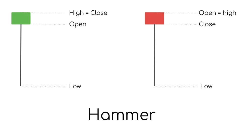
The candle indicates a bullish sentiment. Initially the price is falling sharply but towards the end of the period there is a powerful recovery and buyers enter the market. As a result, the price is pushed up again so that it closes near the opening price. What initially looked like a sharp drop in price ultimately turned out to be a strong recovery with only minimal price losses or, at best, even a slight price increase.
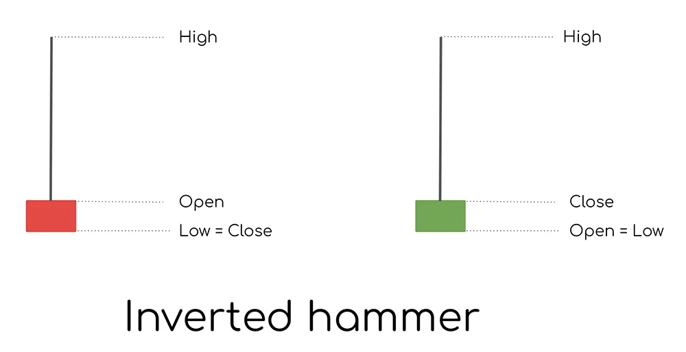
Inverted Hammer candlestick
This is the opposite pattern from the hammer. At the opening of the trading day the price goes up considerably but then sellers enter the market and the price goes sharply lower. Finally the price closes near or at the low of the day. Sentiment is clearly negative, this is a bearish signal. The pattern is also known by other terms such as the 'shooting star'.
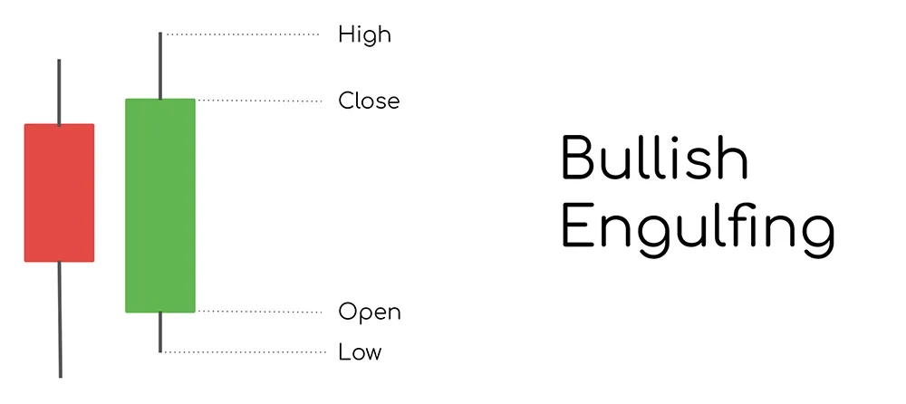
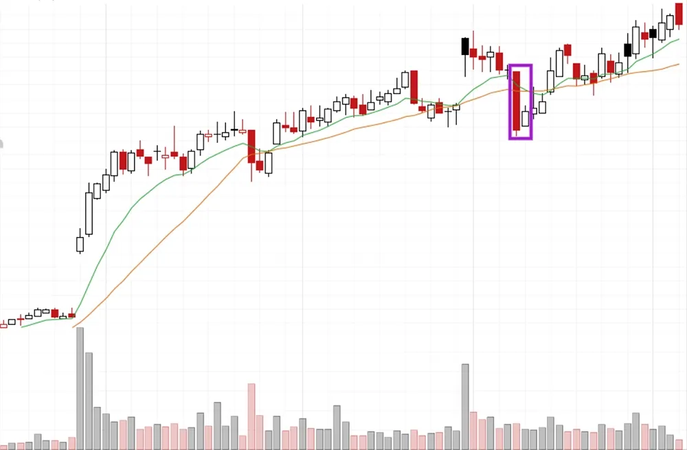
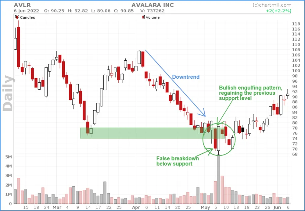
Bullish Engulfing Candlestick Pattern (detailed article available)
The Bullish Engulfing pattern consists of two consecutive candlesticks. This pattern is another warning sign that the current trend (in this case a downward trend) might be coming to an end. For this pattern we mainly look at the shape of the bodies. The only requirement is that the body of the second candle completely surrounds the body of the first candle. The first candle is negative (red), the second one is positive (green).
The opening price on day two is initially lower than the closing price of day one which is at first a negative sign. But throughout the trading session the price rises to such an extent that the closing price rises above the opening price of day 1. The initially negative sentiment at the opening price is thus turned positive.
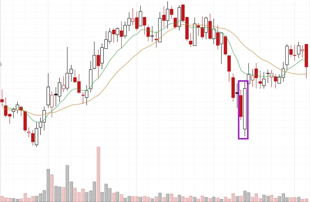
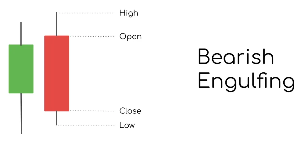
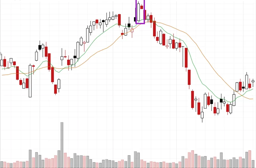
Bearish Engulfing Candlestick Pattern (detailed article available)
This is the negative version of the engulfing pattern. When this pattern occurs after a positive trend it is a warning sign that the trend might reverse. The second candle here is bearish and has a red color. The first candle is green.
This means that the opening price on day two is initially higher than the closing price on day one, a very bullish fact. During the trading day, however, sellers push the price down and with it the positive sentiment. The closing price ends up being even lower than the opening price on day one.
Bullish Harami Candlestick Pattern (detailed article available)
Like the bullish and bearish engulfing pattern, the Harami pattern is a pattern that consists of two variants, both bullish and bearish. However, the pattern is slightly less reliable than the engulfing pattern mentioned earlier. The pattern is most powerful when it occurs after a sharp trend movement. So for the Bullish Harami pattern, after a sharp price drop.
The first candle of the pattern is a down day, a long red candle that ends close to the daily low. The sentiment is very negative. On the second day, however, the price opens higher than the closing price of day 1 and intraday the price rises. The green body and the shadows of day two are fully enclosed in the red candle of day 1. This pattern is a first indication that there is buying activity again after a significant price decline.
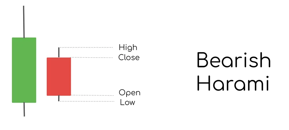
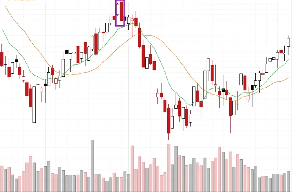
Bearish Harami Candlestick Pattern (detailed article available)
For the Bearish Harami pattern, the candlestick on day two is red coloured. The first candlestick is green. And just like with the Bullish variation the candlestick of day two is completely enclosed in the body of day 1. When this pattern occurs after a strong upward price trend it is a warning signal that sellers are re-entering the market.
Warning
Please keep in mind that candelstick patterns, like all other technical indicators, are based on past data. You should never use them on their own to base investment decisions on. However, in combination with other price elements on the chart such as support and resistance zones, or in combination with specific technical indicators, they are quite useful.
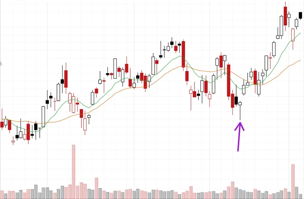
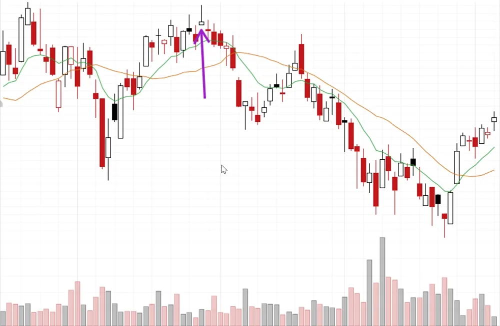
Some examples


They are mainly used to get a better view of the prevailing market sentiment. In this respect they are indeed quite unique as they can visualize the data in several dimensions (shape, color, length).
The ChartMill Team
![]()
![]()
![]()
![]()