
TRADERS - Flat Liners Breaking Out
Published on Chartmill with kind permission of TRADERS’ Magazine. Check the original PDF article here
Finding potential big winners with little effort
Technical analysis is not about predicting what any stock will do next. In fact, any useful study of historical prices has no opinion at all about a particular financial asset, most of the time. Prices are the net result of all orders getting executed. Hence measuring them is about what people, rather than prices, do. We can’t predict the future, but we definitely can get telltale information from charts. This article goes into one possible setup.
One of the most useful books written about handling financial markets is, without doubt, ‘Secrets for profiting in bull and bear markets’ by Stan Weinstein. Although this book goes back to 1988, it is definitely a must-read for any self-respecting investor or trader, taking his/her education seriously. One of the reasons I like it so very much is the fact that it throws out all complexity in looking at the markets and even dares to zoom out, looking the longer term way at charts and goals. Something new generations of traders seem to have forgotten in a never ending arms race for ever more and faster information, suggesting at least partly their susceptibility to some illusionary control.
The setup I will discuss takes Weinstein’s phase model and superposes it with my quantified system dynamics model. My system dynamics model states that financial markets, like any dynamic system, are subject to cycles, gravity, inertia, power laws and, above all important for the setup in this article, capacity.
The phase model
Every equity, at any particular moment, is going through one of four phases. The first phase, called the basing area by Weinstein, is more popular known as the accumulation phase. This is where the bigger public is quickly losing interest in a stock or the market in general. In this phase money ebbs away, resulting in lackluster activity and shrinking volatility and together with it, more often than not, the waning of liquidity. At that time, stock is accumulated in the hands of a smaller public consisting of, often institutional, long term investors willing to sit things out, often by necessity, and take shares out of the hands of the crowd who throws in the towel and wants out. In the second phase, called the advancing phase or up trend, the crowd is coming back. This might be initiated by the marketing of the accumulators in the previous phase. In this phase we see higher bottoms and higher tops. When enough money has fled into the market, there’s almost nobody left holding cash to pay higher prices. That’s where the heavy distribution of stock from the small group into the hands of the crowd, which started in the uptrend, comes to an end. A process giving higher volatility as the last ones are trying to get in and distributors need to support their own prices while net selling their positions. This is called the top area or distribution end. When distribution is fulfilled, no support is needed anymore and nobody’s left with interest and cash to pay the current or higher prices. This is where the final and forth phase takes off giving a down trend which Weinstein calls the declining phase, characterized by lower tops and lower bottoms. These phases are illustrated in figure 1. This is but an example though. The phases don’t necessarily have to come just one after another in that order. Several accumulation stages, for instance, can separate different parts of the same uptrend, giving different intermediate horizontal bases on the way up.
While we have the chart present, take a look at it and notice how prices tend to fall (downtrend) quicker than they appreciate (uptrend). This is the gravity part at work. To push prices higher, more money has to come in from new buyers for them to be able to pay more than the current shareholders did. This comes with financial limitations. When selling the stocks one holds however, there are no such limitations. People can throw out at $1 whatever it was they bought at $100 the day before, if they really want. No money is needed for that. Hence prices have to be pushed up a hill but can end right where they started in a fraction of the time they needed to get up there in the first place, by the tip of a finger.
In each of these phases an equity has to be approached far differently. Here we are going to look at a possible setup that can emerge while in an accumulation phase.
Adding system dynamics
A lot of what’s going on in technical analysis is nothing more than ‘chasing the illusion of control’, although most market technicians won’t be happy to admit this. It can even be proven to some extent. But that would be a whole other discussion. Nevertheless there is quite some useful information we can get out of historical trade numbers if we look at them from the viewpoint of how participants ‘feel’ at any moment, in addition to the sure facts we have at particular points on a chart.
The blue arrow in figure 2, which is a zoom-in on the accumulation phase of figure 1, points towards such a certainty. What do we know for sure at the lowest point in a chart. Of course we only know what that lowest point was later on, so let’s pretend we’re at the right side of the chart when doing this analysis. It’s a certainty that no one was holding shares with a profit there. At least no shares that were bought somewhere on the chart. After all this would imply they bought shares at a lower price. But at no point were there shares sold at lower prices. Since shares can’t be ownerless, all of them belong to someone and everybody is seeing a loss. Every shareholder is in pain. It’s like a battery of pain that was fully charged at the lowest point on the chart. Now, what happens when shares are traded after that point. There’s a distinct possibility that they leave the hands of someone remembering the pain of the preceding downtrend and go to an new owner who never experienced that same loss. At that moment those shares shrug off their pain, depleting the ‘pain charge’ of all shares outstanding.
With this dynamics in mind we can try and quantify the amount of pain and the number of shares subject to it. Let’s do that.
A battery of pain
Back to figure 2. Remember, we’re analyzing the chart on April 1th, 2009, at the rightmost candle available. When we look back at the lowest point, somewhere around the end of October 2008, we can start counting the number of shares traded. Those shares might now be in the hands of people not remembering the previous decimation of the stock. Right, there might still be people holding shares with a loss, even with a big loss resulting from the downfall. But they become outnumbered as time moves on. And there probably will be shares that got traded more than once since the lowest point on the chart. But we have to look at this as a healing process where more and more shares get out of the hands of people who suffered the severe blow in 2008. A healing process which depletes the battery of pain.
Well, at the right side of the chart, the total number of shares that were traded since the battery was fully charged, amounts to 75% of all shares outstanding. Taking this just a little but further, this amounts to 108% of the free float in this stock (thereby excluding all shares like the ones locked into institutional and insider hands and not generally available for trading).
On the chart we further use Chartmill Channels, as discussed in the 2011 October issue of this magazine. What’s more, in the horizontal channel we can see relative strength appreciate, from worse performance than the market to less weak and even better performance than other stocks. That means that when and if the stock should start it’s advance, most of the pain of the previous decline has disappeared from public memory because of renewed ownership, without the share price starting an uptrend. This is exactly the kind of ‘healing’ we want to see in this setup. This setup made me buy this particular stock at €3.18 when it broke out of the channel, at what now seems to have been the end of the bottom after the financial storm of 2008.
Another useful tool to measure pain and relief is a volume weighted average of price. This implies transactional data being available, instead of merely OHLC interval data. Such an average clearly shows what the average price of all traded shares has been over it’s moving window. It gets even more interesting when we hold on to a certain starting point for this window, while adding more and more data to it, thus moving only the endpoint of the interval. This anchoring can be done at important price lows and highs as shown in figure 3 where we anchored the VWAP to the bottom, after the breakout. It kept me rebuying the stock about a week later after being stopped out of it halfway May and once more after the retracement low of July, having been stopped out once more halfway June. Anchoring VWAP’s are a great way of estimating support and resistance and placing stops. Anchored VWAP’s can be visualized on the advanced charts section of ww.chartmill.com by just right clicking a chart and choosing ‘add anchored VWAP here’.
Nuts and bolts
Once the total free float has rotated, or nearly so, the Chartmill Channel, as an objective parameterless horizontal channel, can act as the trigger for an entry on a buy entry stop just above the upper channel line. If intraday peaks through the channel were often the case before, set the stop above the highest peak. I want to stress once more that as a new low is reached the whole exercise has to be done over again from this new low. As is the case with Facebook, one also has to watch the free float and adjust calculations accordingly. In the case of Facebook, a lot more shares close in on their lockup end date by November 14th, including the shares of Mark Zuckerberg himself. After this insecurity is take away, if the stock doesn’t start a new down leg, a bottom could well be set and the stock has to be watched closely. According to adjusted free float rotation velocity the whole rotation could be over by the beginning of December.
Once a first position (0.5% to 1% risk) starts to materialize, the position can be tripled or quadrupled with a buy entry stop just above the first swing high above the Chartmill Channel. This buy entry stop could be trailed down as a retracement towards the upper channel line would happen to take place. A retracement to the upper channel line in a matter of days after the breakout without breaching the channel again, should serve as a very high probability of a strong trend on the way. If no retracement occurs and the stock just takes off, keep stalking it for an entry on the first retracement with a trailing entry buy stop.
Exit is done by a trailing exit stop just below the most recent or second to last swing low. The initial stop after entry could be placed just below the last swing low or, if that’s too far away, just beneath but not too close to the upper channel line.
Wrapping up
We discussed a workable setup while going through accumulation. This kind of setups are mostly available in large numbers after markets went down for a while, but they might pop up on individual stocks at any moment. They seem to work even better with fallen IPO angels. One such stock I’m currently watching for this setup is Facebook. Of course as more shares come out of lock-up by November 14th, the calculation has to be recalibrated every time the free float changes.
There are two tremendous advantages to this setup. First, if an uptrend starts, we know most of the shareholders have fun on their positions in the green. And as buying begets more buying, there’s no telling how long such a trend might go on, giving very high P/L trades if they materialize. Secondly, while in the sideways accumulation phase, one can extrapolate the free float velocity into the future based on the average daily volume. Doing this for Facebook results in having total depletion of the pain battery somewhere around the start of December. So perhaps we’re in for an early Christmas present.
However, this setups don’t tell a thing about the possibility that an uptrend will start. So the downside of this setup might be weariness while constantly trying a toe in the water and getting stopped out as the stock falls back in the horizontal channel.
To finish this article, in April 2009, ending May, numerous signals for this setup popped up on my radar after having seen none for months in a row. This certainly was no coincidence, as the market was telling me the first green leaves were appearing from the scorched financial earth. That makes this setup a nice base for a breath indicator and a really great telltale, giving better and earlier signals than any index would do.
[FIGURE 1]
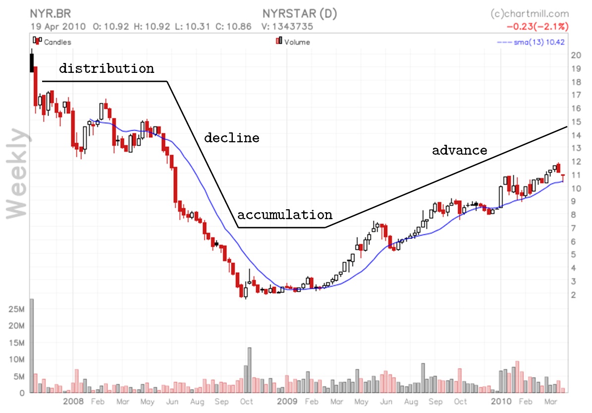
[HEAD] Weinstein’s four phase model.
[CAPTION] Figure 1: At any time a stock is either getting distributed or accumulated, declining or advancing. These phases not necessarily have to follow each other in that order. An advance, for instance, can be interrupted by another accumulation phase. Notice the fact that this is a weekly chart, giving a much clearer view on what phase an equity is in.
[FIGURE 2]
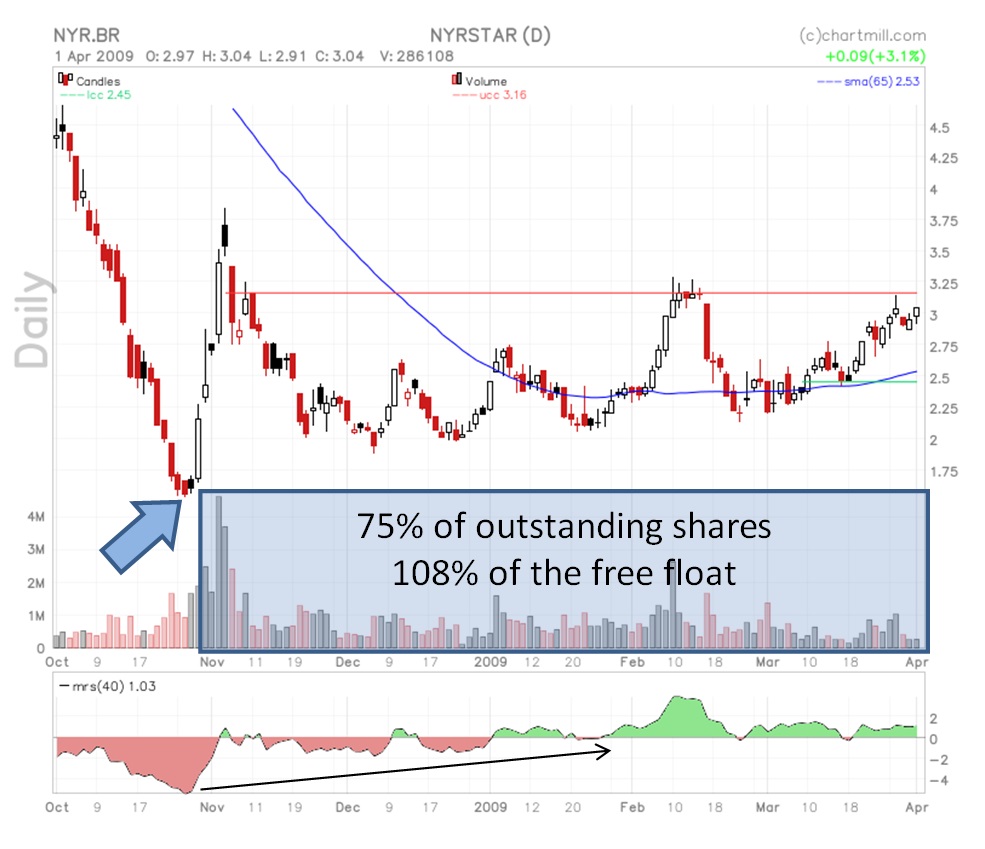
[HEAD] Accumulation phase up close.
[CAPTION] Figure 2: A zoom in on the accumulation part of figure 1. Going back to basic market dynamics and how participants feel at any moment does uncover some useful information in such a setup. The article goes in depth on how to analyze such a situation.
[FIGURE 3]
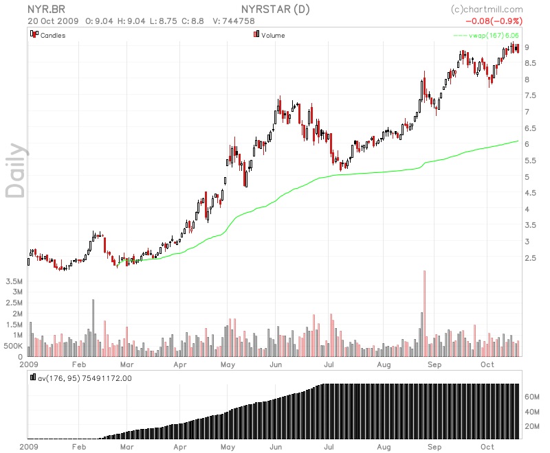
[HEAD] Measuring pain and relief in a stock using anchored VWAP.
[CAPTION] Figure 3: VWAP stands for Volume Weighted Average Price. In the above chart the calculation window of the VWAP is anchored with its start to the bottom of where the uptrend starts, measuring what the average price is shareholders paid up until the end of the calculation window. Anchoring VWAP to important tops and bottoms, make great support lines, as can be witnessed on the chart during the first half of June.
[FIGURE 4]
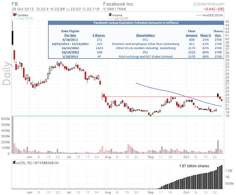
[HEAD] Facebook as a more recent example of this setup.
[CAPTION] Figure 4: With the lock-up of 1.323 billion shares ending on November 14th, the stock will either get more pressure or the insecurity will be gone setting ground for a breakout. Based on the current free float rotation speed, the setup could materialize as soon as the start of December. The recent upheaval, a part of the healing, could not make the stock penetrate the Chartmill Channel permanently. It changed perception with the crowd though that a bottom may have been set.
DIRK VANDYCKE is actively and independently studying the markets for over 15 year, with a focus on technical analysis, market dynamics and behavioral finance. He writes articles on a regular basis and develops software, which is partly available at his co-owned website www.chartmill.com. Holding master degrees in both Electronics Engineering and Computer Science, he teaches software development and statistics at a Belgian University. He’s also an avid reader of anything he can get his hands on. He can be reached at dirk@monest.net.