Analyzing sectors and industries in the stock market (Sector Rotation)
In this article, I will discuss the concept of sector rotation using the sector page on ChartMill. I will first go over the sector page itself and explain the different options available. Then we'll dig a little deeper into the different sectors and industries and what sector rotation actually entails.
There is also a video available about this subject, link here.
The ChartMill Sector page
First of all some explanation about the different buttons that are visible on the sector and industry page.
- In the top left corner (1) you have the option to choose between US, Canada or Europe. This choice needs little explanation. These are in fact the regions of all the stocks available in our database.
- Next (2) you can make a choice between GICS or NAICS.
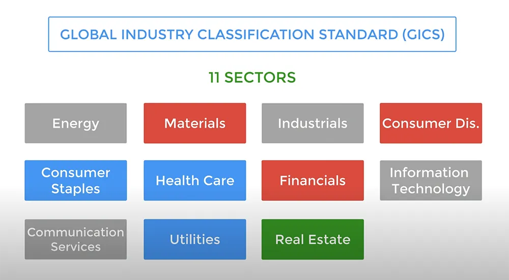
GICS is the abbreviation for 'Global Industry Classification Standard (GICS)', which is a classification of companies based on sectors. In other words, it shows the sector in which the company operates.
A distinction is made between 11 different sectors:
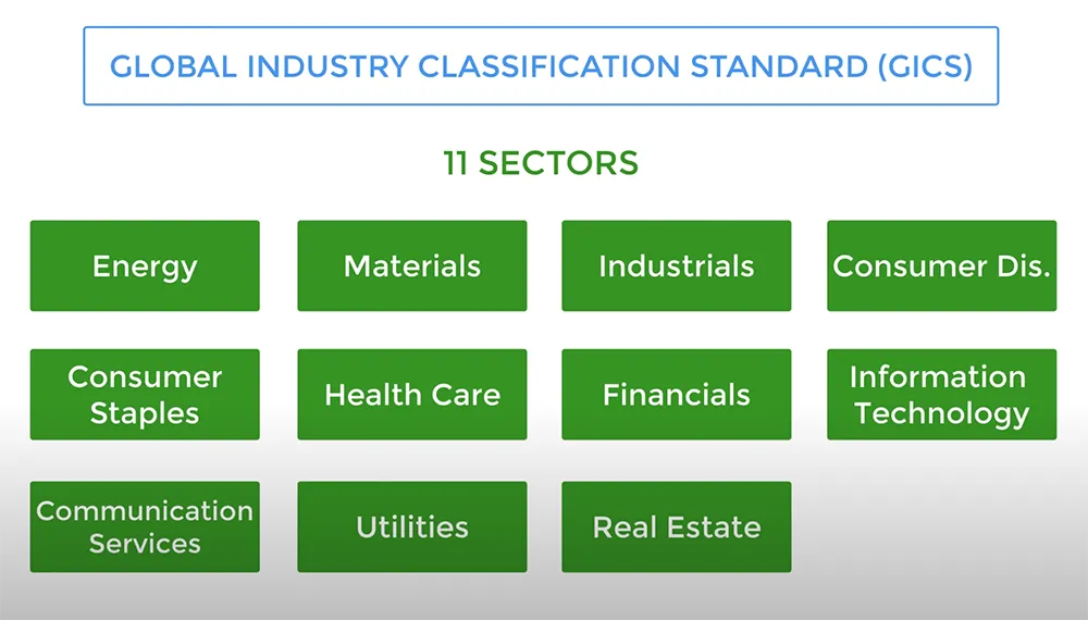
These sectors are again divided into 24 groups, 68 industries and 157 sub-industries (3). All publicly traded companies can be classified into these.
In addition, there is also something like NAICS, The "North American Industry Classification System (NAICS)" which is used by companies and governments to classify and measure economic activity in the United States, Canada and Mexico. NAICS replaces the former SIC (Standard Industrial Classification system) and allows for easier comparison across North America.
In this article we will continue to work with the GICS classification because this structure applies to all companies around the world.
Finally, on the far right you can choose between the TA or FA view (4 - screenshot above).
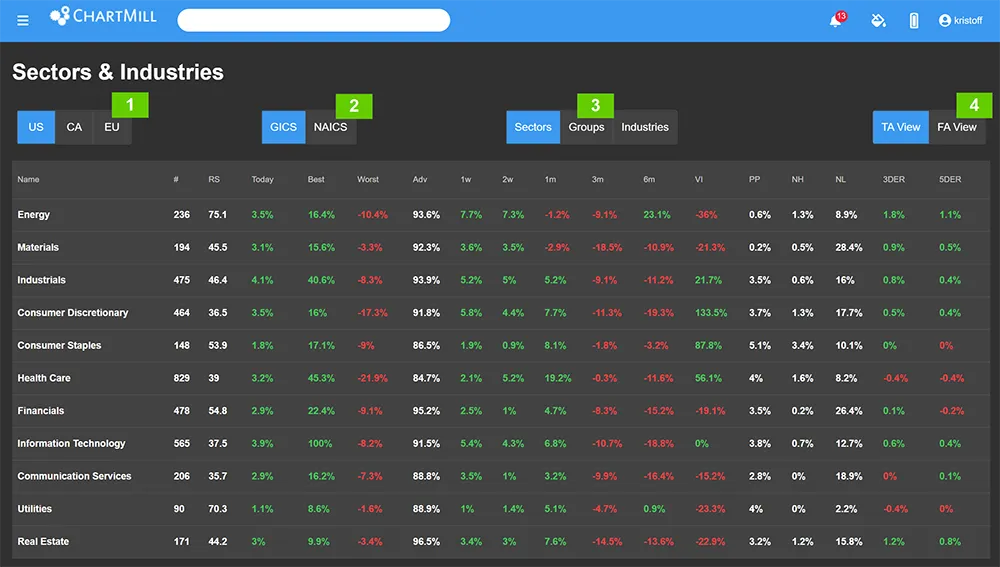
The TA view mainly shows the performance of the sectors on different timeframes, ranging from 6 months to 1 week (1 - screenshot below).
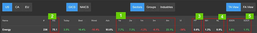
The average relative strength (2) shows how well the stocks in this sector have done over the past year compared to all other stocks in our database. The maximum number is 100, the minimum is 0. The higher the number, the better the relative strength of the sector against all other stocks. You can read more about relative strength in this article.
PP stands for pocket pivots (3). This column shows the percentage of pocket pivots that were found in the shares of the specific sector. In short, a pocket pivot occurs when the price breaks through a specific moving average with a certain minimum volume. It would take us too far to go into detail in this video but you can watch a video where I explain what exactly Pocket Pivots are and how you can use them in a trading strategy. There is also an article available around pocket pivots.
NH and NL are short for "New Highs" and "New Lows." (4). That way you get a quick overview in which sectors the most NH or NL occur. A sudden increase in the number of shares reaching a new high is another indication that investors are finding the sector more attractive.
The 3DER and 5DER columns show the average 3 or 5 Daily Effective Ratio of all stocks in the industry or sector (5). This allows you to sort the sectors by their 3 or 5 DER%. This sorting will show you which sectors or industries show the strongest accumulation or distribution by large (institutional) players. More extensive information on effective volume and this effective ratio can be found in the book Value in Time: Better Trading through Effective Volume by Pascal Willain.
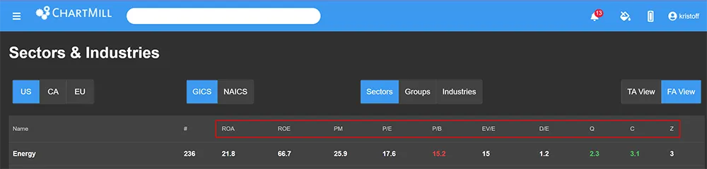
The FA view (screenshot below) provides an overview of a number of fundamental ratios at the sector level. However, we will not go into that further as it is of little relevance in this article where we will focus on identifying sector rotation through the various economic cycles.
The different sectors.
As I just showed when explaining the GICS classification system, 11 different sectors are distinguished worldwide.
Some of them are cyclical (red), others rather defensive (blue). A number of sectors are also called sensitive (grey). This is the category that falls between cyclical and defensive.
The Real Estate sector (green) is a difficult one, some classify this with the cyclical sector because supply and demand of real estate is highly dependent on the state of the economy, while others believe that Real Estate is a defensive sector because housing is a basic need.
Cyclical stocks
These are stocks of companies whose operating results are strongly linked to the economic context. When the economy picks up, cyclical stocks perform above average because their earnings accelerate with it. When growth slows down, however, you should expect above-average price declines for these sectors.
So these stocks are sensitive to business cycle fluctuations in the economy. This business cycle has times of expansion, peaks, recession and recovery. Most cyclical stocks involve companies that sell consumer durables, which are bought less by consumers during a recession but bought a lot during a booming economy.
Defensive stocks
Defensive stocks represent companies that are (much) less sensitive to the economic context and they will have a more stable earnings trajectory over the long term, during both better and worse economic times. However, it does not mean that they are immune to a recession. Keep in mind that defensive does not automatically means ‘safer'. As a rule, defensive stocks do tend to be less volatile than their cyclical counterparts. In a sharply declining market, these stocks will also fall, but the loss will generally be more limited than in the typical cyclical sectors. These sectors mainly contain items that we need on a daily basis anyway, regardless of the economic context. After all, everyone always needs food, medical care and basic facilities such as electricity and water.
Sensitive stocks
These include those companies that, like cyclical companies, evolve with the economy yet are less dependent on it. They are, however, more sensitive to it than the truly defensive sectors and therefore fall somewhat into a vacuum between cyclical and defensive companies.
Now that we know that there are different sectors that each also react differently to the way the economy evolves it is time to take a closer look at the concept of sector rotation.
What is sector rotation?
Sector rotation is based on the basic principle that not all sectors do equally well at the same time. Therefore, one will try to shift investments from one sector of the economy to another sector when it is felt that the other sector is a better choice at the time because of the business cycle.
For example, in strong performing markets, stocks from cyclical sectors will do particularly well. However, if we are faced with a period in which the economy cools off or is heading straight for recession, it is precisely these cyclical companies that will suffer the most.
The private investor can avoid this by selling those positions and securing profits (or not allowing losses to skyrocket). However, if you wish to stay in the market, you can opt to invest the available cash in more defensive sectors that are less sensitive to such cycles.
The disadvantage of such a sector strategy based on specific stocks is that it is quite intensive and requires a lot of knowledge and active monitoring. Moreover, it comes with a fair amount of transaction costs, especially for individual stocks. Therefore, it is mainly something that professional investors apply. Fortunately, there are also sector ETFs that make it much easier to apply such a strategy. More on that later in this article.
But even for those who, as private investors, are mainly engaged in swing trading, it is very interesting to keep a close eye on the performance of the various sectors. If, as in the current circumstances, economic growth slows down, by looking at the sector performance you can fairly quickly get an indication of which sectors and industries are less sensitive to this, or - even better - can benefit from it.
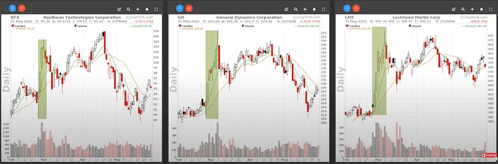
Keep in mind, however, that specific events can also cause certain rotations that in themselves are not directly related to the economy. A great example of this was seen with defense companies that watched their stock price rise sharply with the start of the war in Ukraine (February 2022). These are companies from the industrial sector, a sector characterized as "sensitive".
Now let's revisit the sector page in ChartMill to verify whether the theory of cyclical and defensive sectors is correct. Currently we are facing a flagging economy and even the possibility of a global recession certainly exists. So we should be witnessing a shift from cyclical to more defensive sectors in which investors are becoming active.
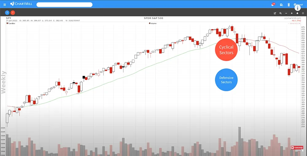
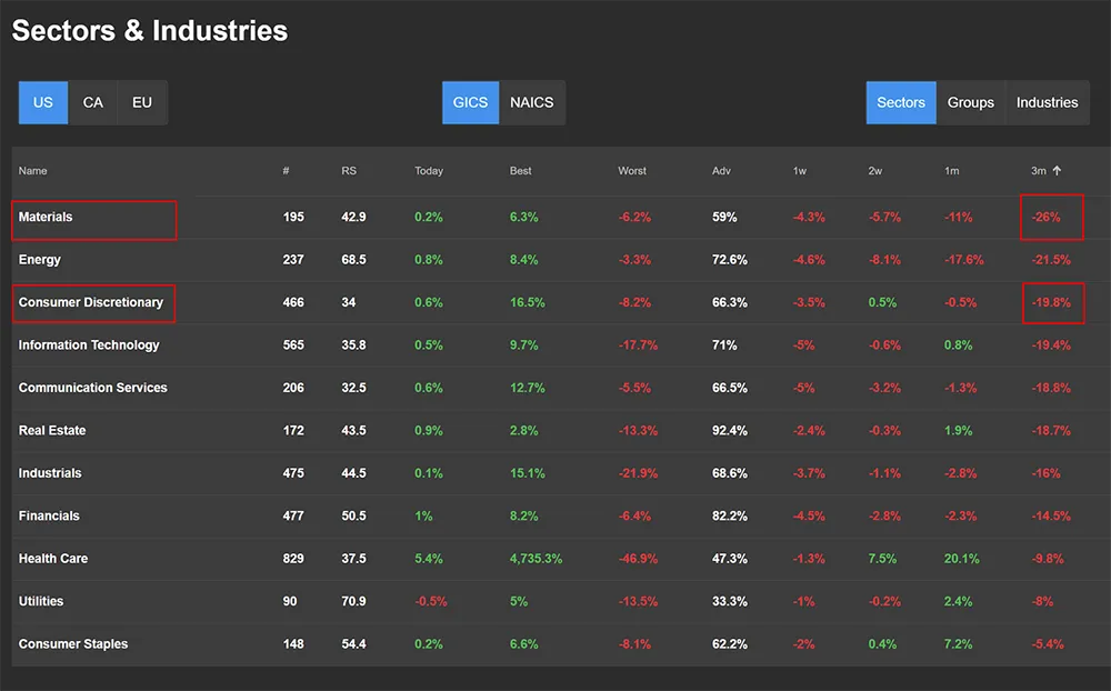
If we sort the stock market performance for the last 3 months from low to high, we notice that for the first and third place both are indeed cyclical sectors.
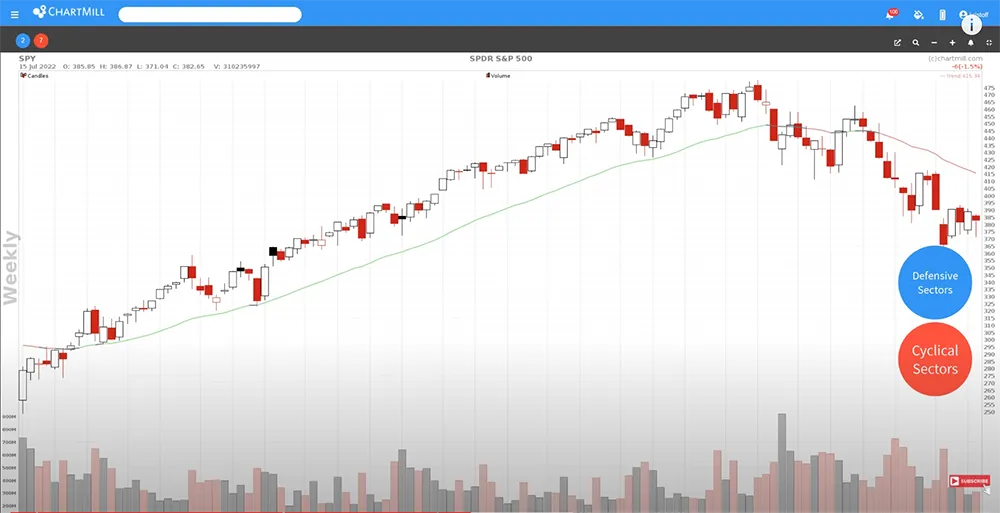
Turning the ranking around, the picture becomes even clearer. The three best performing sectors are all defensive!
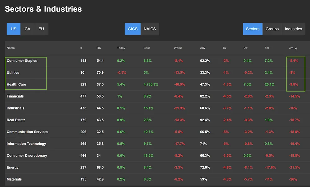
The same is true for the last month and the last week. Only when ranking over the last two weeks a cyclical sector appears very briefly in the top 3. In any case, it is clear that since the last three months, defensive sectors are at the top and that is where most of the money now is flowing.
In the video, I show you how to pinpoint which specific groups and/or industries within those high-performing sectors contributed the most to the performance.
Sector ETFs
As a private investor for the long term, you may choose to apply sector rotation based on specific sector ETFs. For example, suppose you want to invest in the energy sector. The range of energy companies is immense. Making an individual choice is not easy. That choice will also be decisive for your result. If you happen to choose a share of which the company appears to be in bad papers, it will have a negative impact on your result, while the sector in itself can perform quite well and your assumption was not wrong at all.
For the private investor who does not have the possibility to invest a lot of time in fundamental and technical research or who lacks the knowledge to do so, the option of a sector etf is almost always the better choice because you follow the entire energy sector instead of just one specific company.
Despite the fact that you choose a broader ETF, you still focus on that part of the market where you expect a lot of growth potential.
This is a watchlist of all sector-specific ETFs for the US market. A total of 11, just like the number of sectors in the GICS classification.
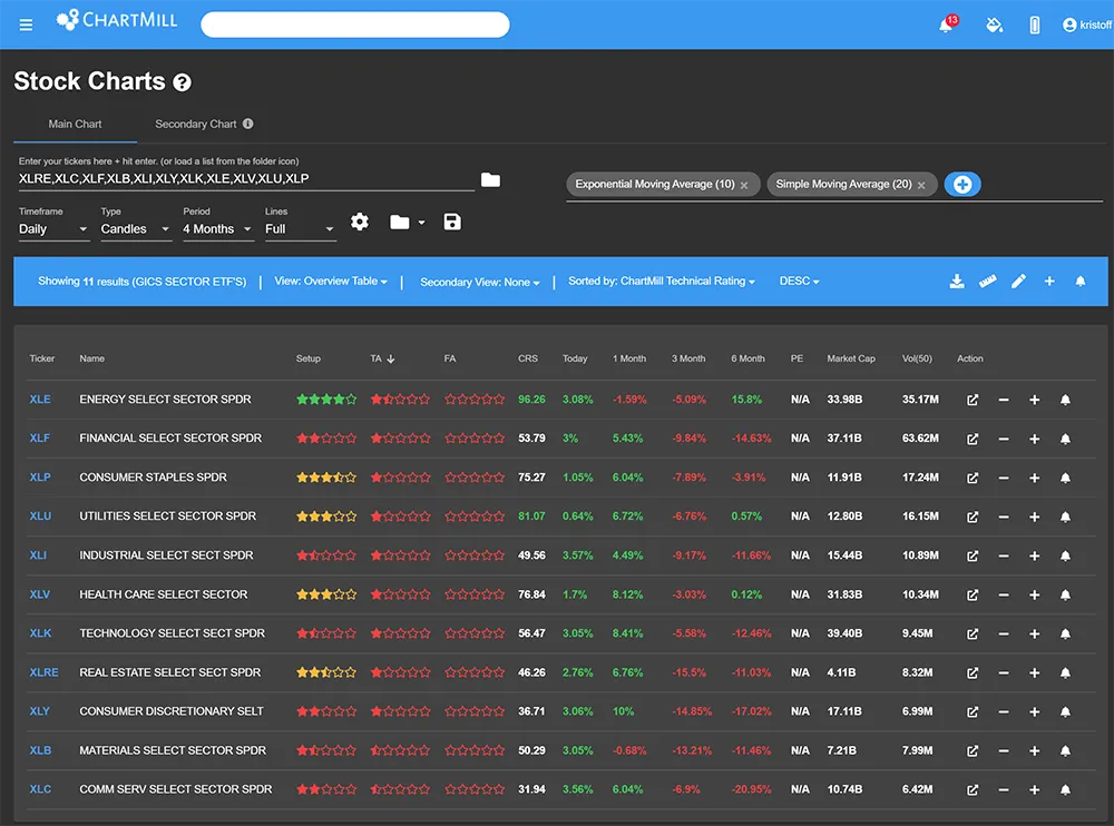
This is a direct link so you can open and save the list in ChartMill yourself if you are interested.
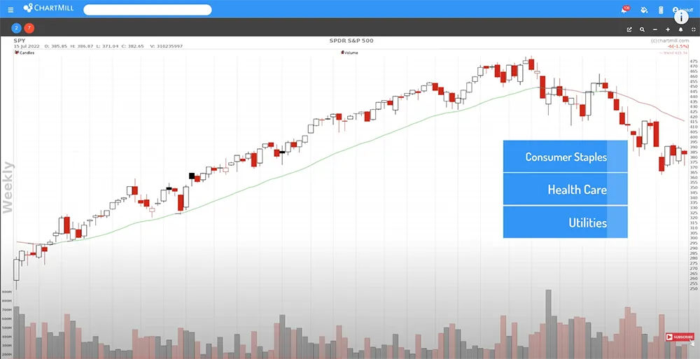
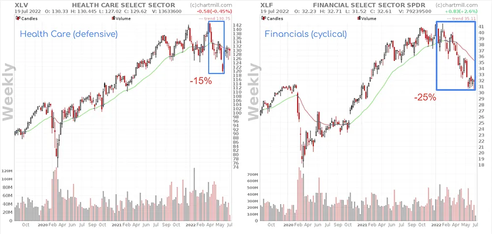
What already appeared when consulting the sector page can also logically be seen on these weekly charts. In the current challenging economic conditions, the classic defensive sectors are of course also suffering losses, but quite a bit less than their cyclical counterparts.
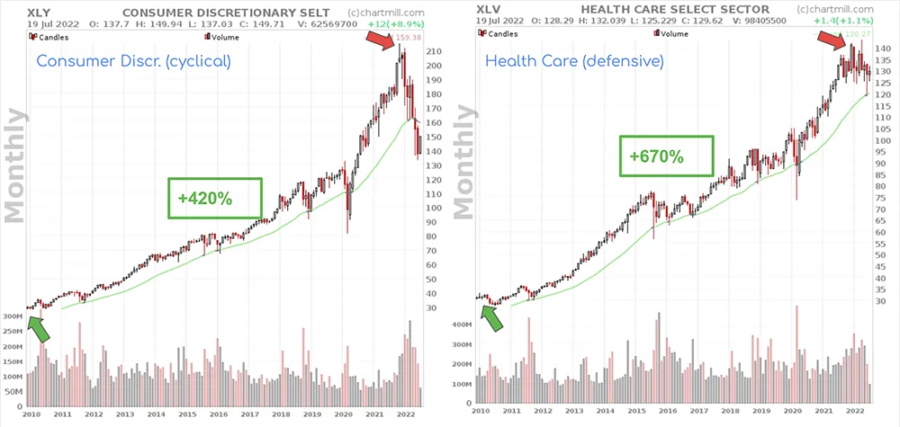
However, if we look at the price increase since 2010, it is striking that the cyclical shares have increased a lot faster. As an example, the cyclical sector ETF XLY (Consumer Discretionary), versus the best-performing defensive sector etf XLV (Healthcare).
You can also see on the charts that the intermediate declines are much less pronounced for the defensive sector ETFs than for the cyclical ETFs, which means lower volatility.
You can therefore use these ETFs if you want to invest sector-specifically on the basis of how the economy evolves. You will then emphasize defensive sectors when the economy is struggling and you can fully go for cyclical sectors when you think the time is ripe for the next bull market. However, also take into account specific events that may cause certain sectors or industries to suddenly do much better (or much worse), regardless of the economic cycle.