Stock Market Golden Cross
By Kristoff De Turck - reviewed by Aldwin Keppens
~ 5 minutes read - Last update: Oct 16, 2023

What Exactly Is The Stock Market Golden Cross?
The Golden Cross is a term that resonates with seasoned investors and traders. It represents a critical technical analysis pattern that occurs when two essential moving averages converge, signifying a potential shift in the market's direction.
Specifically, the Golden Cross occurs when the short-term moving average, typically the 50-day moving average, crosses the long-term moving average upwards, often the 200-day moving average.
Example
Imagine a scenario where a 50-day moving average, which is a shorter-term indicator, surpasses the 200-day moving average, a longer-term indicator. This event forms a Golden Cross, signaling a significant uptrend in the stock's price.
For investors, this is a bullish indicator, suggesting that the stock may continue to rise.
Significance of the Stock Market Golden Cross
Investors use the Golden Cross to confirm a trend reversal in a downtrend. When the short-term moving average crosses above the long-term moving average, it suggests that the stock is moving from a bear market to a bull market.
Moreover, the Golden Cross is regarded as a potent bullish signal. When it occurs, it often marks the beginning of a prolonged uptrend in a stock's price movement. This presents an excellent opportunity for investors to buy and potentially profit as the stock climbs higher.
More information on how to use the Golden Cross in a trading setup can be found in this article, "How to Enter the Market after a Golden Cross Signal? An Example of a Buy Setup"
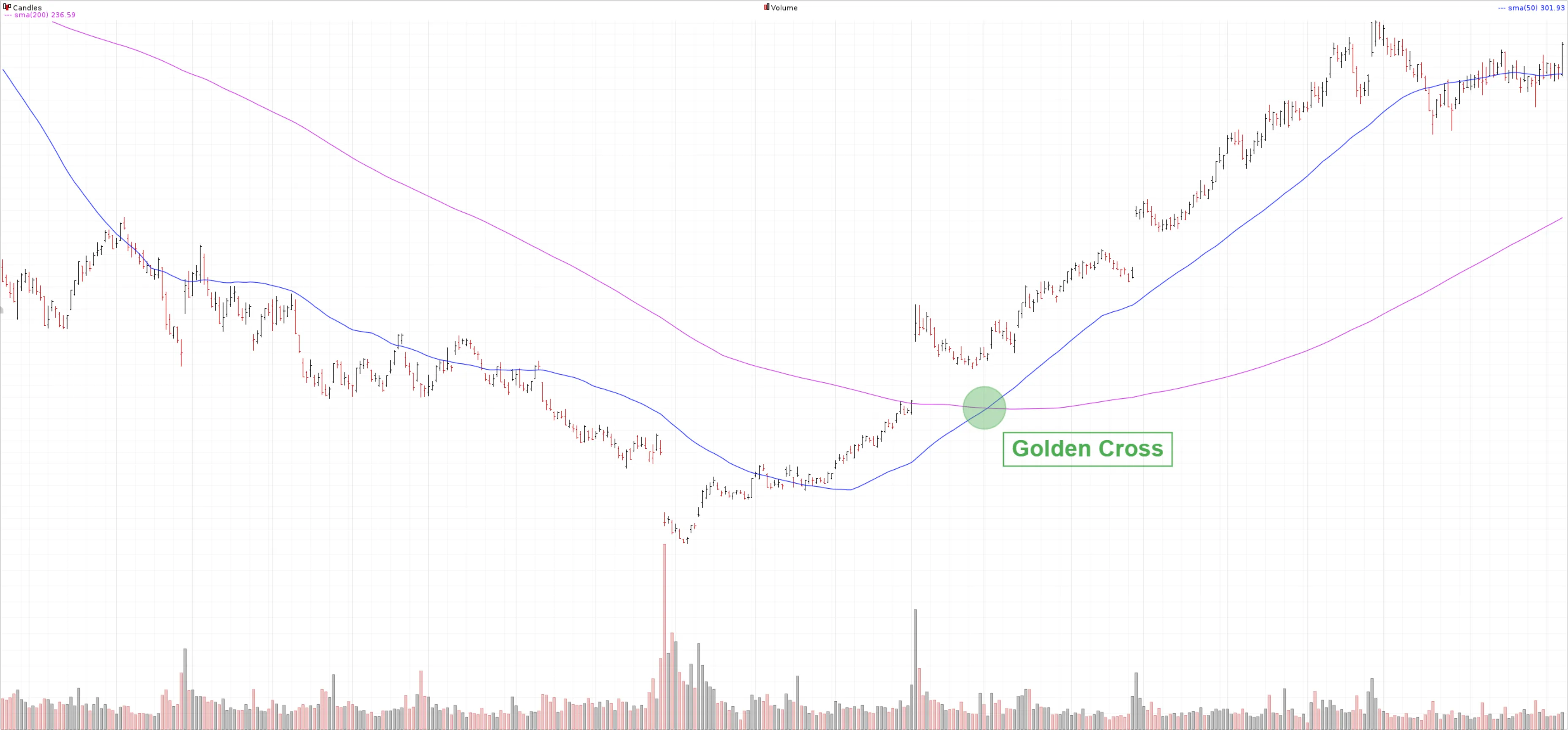
How does this pattern emerge?
A price chart is dynamic and therefore constantly changing. As an investor, it is not always obvious to determine the prevailing trend or to judge when, for example, a falling trend is coming to an end.
Crossing moving averages such as the 50 and 200SMA provide a solution here because they objectively visualize the short and long term.
In a clear downward trend, both the 50 and 200SMA will fall and the price will quote below the short and long-term average. The 50SMA is thereby lower than the 200SMA and closer to the current price movement.
Initially, the downtrend will lose momentum and the price will begin to move sideways. New lows are still possible but they are usually short-lived. Many false downward breakouts typically occur during this phase, immediately countered by buyers who push the price back up. During this phase, the course of the averages will also change. Both MAs will curl upwards but this will happen faster for the 50SMA because the number of periods on which it is calculated is shorter and consequently recent price changes have a greater impact.
The 50SMA is thus moving toward the 200SMA and getting closer and closer to it. If the price rise continues, it will eventually lead to the 50SMA crossing the 200SMA upwards. This is the so-called "golden cross," a bullish signal indicating that the short-term average is higher than the long-term average. This is a strong indication that the trend of the stock is turning from bearish to bullish.
Confirmation of the new uptrend occurs when subsequently both SMAs rise with the 50SMA being higher than the 200MA and the price of the stock quoting higher than both SMAs.
Check this video for further explanation.

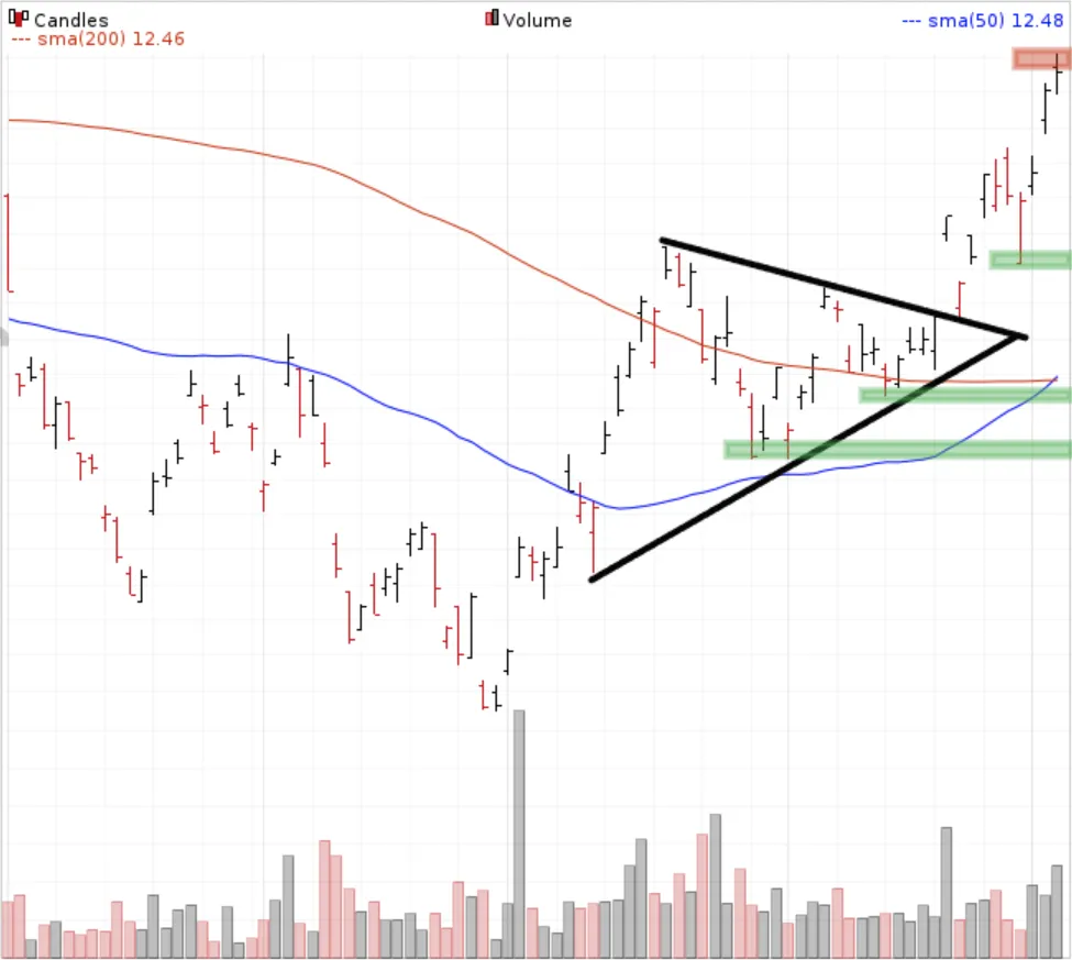
Golden Cross vs. Price Action
Even though a Golden Cross can be used as a buy signal, it is important to always keep an eye on the price action itself as well.
After all, moving averages are lagging indicators and before a crossing occurs, in many cases the price will already have risen considerably.
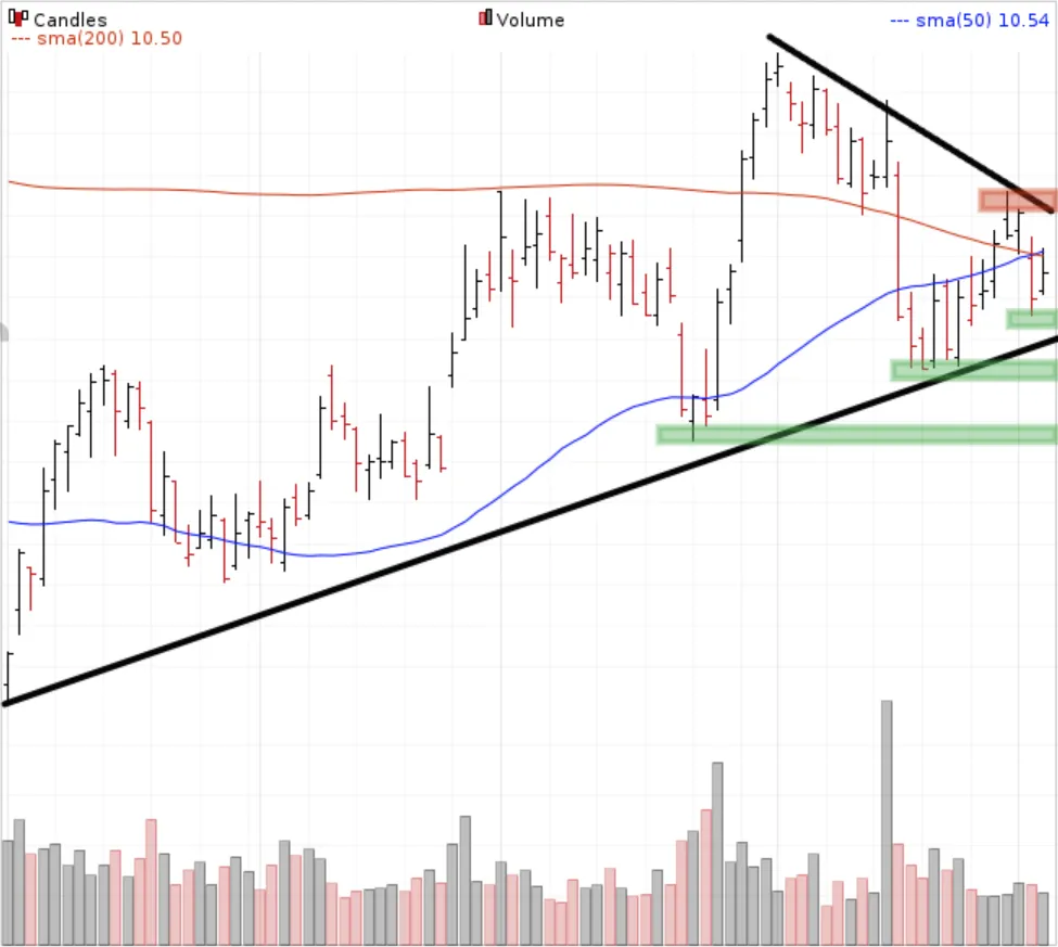
In the charts below you can see what is meant by this. Both charts show a golden cross.
On the chart above, the price has already risen very sharply at the time the two MAs cross. There is certainly a chance that there will be an intermediate price drop here. So this setup is less suitable for effectively using the golden cross as a buy signal.
On the chart below, the price is very close to both MAs and a higher swing low has just formed. As soon as the price goes higher than the horizontal red resistance level, the stock can be bought with the initial stop-loss placed below one of the green support zones.
It is quite clear that the right chart shows a better setup than the left.
FAQ
Is A Golden Cross Buy Signal Reliable?
Moving averages are lagging indicators which means that the effect becomes visible only after the price has adjusted. In case the 50SMA crosses the 200SMA upward, the upward price trend will have been visible on the chart for some time. So the chance of false signals is just as much present with this crossing signal as with other technical indicators. Therefore you should never use the signal as the only indicator to decide whether or not to take a position.
Golden Cross Day Trading?
Theoretically, you could use the crossing of the 50- and 200-day average for intraday trading as well. But you have to take into account the much shorter time frame.
The 50 and 200SMA were originally intended to be used on daily charts in a swing trade strategy where positions are held overnight and remain in port for several days to weeks.
To trade on the more volatile smaller timeframes, the intervals of such moving averages are too long to respond quickly to intraday price fluctuations.
However, the principle of crossing MAs remains the same. For example, a popular setting for the golden cross day trading is 9 and 21 periods.
Some day traders even use a combination of 3 moving averages such as 5/8/13.
Ultimately, you are going to have to test which settings work best for you. The more volatile the instrument on which you plot the averages the shorter the intervals will be.
Is Golden Cross Better Than Buy And Hold?
Both strategies have a lot in common. This is because a Golden Cross is quite exceptional and trades are made only when the two averages cross.
According to this article by Quantified Strategies, which conducted a backtest on the S&P500 since 1960, it appears that the two strategies are not very far apart in terms of returns.
For the Golden Cross strategy, the CAGR came out at 6.6% while the return for the Buy And Hold strategy came out slightly higher at 6.9%. But as the article points out, there are some important nuances to this.
- The strategy using the 50 and 200SMA was only invested 69% of the time (since 1960).
- Moreover, the max drawdown came in significantly lower at 33% while it reached 56% for the buy-and-hold investor.
So when risk-adjusted returns are calculated, we get a CAGR of a whopping 9.5% for the Golden Cross strategy.
Other articles that you may find interesting
How to Enter the Market after a Golden Cross Signal? Example of a Buy Setup.
Keeping an eye on the price action after the signal and waiting for a price correction in the new trend creates great opportunities where you can enter the market with relatively little risk. Read more...
Death Cross Stocks Chart Pattern
The death cross occurs when the short-term price average falls below the long-term price average. Read more...
How to scan for the Golden Cross or Death Cross?
In this article, we go over the screen options for filtering stocks based on the appearance of a Golden or Death Cross. Read more...
The golden cross and death cross explained (Video)
Using The 200 Simple Moving Average - 200 SMA
The 200-day moving average is used by both technical and fundamental investors to obtain insight into the long-term price trend of the stock/etf/index. Read more...
Exploring The Best Moving Averages For Swing Trading Success
Traders or investors employ various tools and indicators to make decisions regarding entry and exit points. One such tool that plays a crucial role in swing trading is the moving average. Read more...