
How to prepare for the next bull market?
Last update: May 16, 2022
Admittedly, it may sound a bit opportunistic when you consider the current market conditions... Stock markets worldwide are taking serious hits and even the strongest companies are seeing a lot of their market value evaporate.
This does not mean that you should just throw in the towel. In a previous blog post, I already wrote that patience and consistency are important qualities for long-term investors to survive in the stock market jungle. At the same time, it is important to stay vigilant. Rain is always followed by sunshine, and eventually there will be a recovery in the stock markets.
One possibility is to simply buy more shares when prices have plummeted (buying the dip). But if we were asked, that would be downright dangerous. The consequences of a real bear market go beyond mere temporary price pressure. Companies that previously had low margins will find it very difficult to stay afloat when the economy takes a turn for the worse, especially if their previous success was largely based on the general positive market sentiment and they could surf along on the good results of their sector or industry peers. With such companies, the danger lurks around the corner that you can keep buying at lower prices until you end up with a penny stock...
So as an investor, what signals do you best keep an eye on to recognize the next bull market?
Key macroeconomic figures
Macroeconomic figures come in many shapes and sizes and they are especially useful for keeping a broad view of the global economy and how it is evolving. Some important figures include :
- Gross Domestic Product (GDP)
- Consumer Price Index (CPI) and Inflation
- Labor market figures
- Housing Prices
- Interest Rates
- Retail Sales
- Production and manufacturing
An overview of these and other macro-economic indicators for the USA can be found here. For Europe you can consult this link.
Note that these indicators do not so much directly determine the direction of the stock markets, but they do play a role in the political decisions that are taken to support the economy. In this sense, they do have an indirect impact. Moreover, the announcement and publication of these indicators can lead to a temporary (sometimes sharp) increase in stock market volatility. A textbook example of this is the reaction of the financial markets to the Fed's latest interest rate decision.
Long-term technical market view
In our market updates we always consider the long-term price trends of the main US index ETFs, being the SPY, QQQ, DIA and IWM. We do this by looking at the price charts on a weekly timeframe where the trend is determined by the ChartMill Trend Indicator. Red is negative, green is positive and gray is neutral.
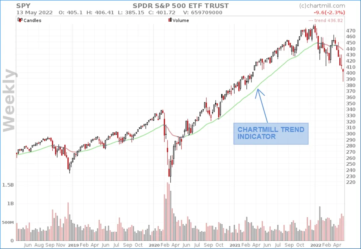
The advantage of such a weekly timeframe is that you easily filter out the noise of the daily fluctuations. Moreover, the current trend is determined in a completely objective way. A trend indicator which again turns gray and possibly even green for several indices is a first price-technical indication that the long-term downward trend is losing strength and a trend reversal may be imminent.
Number of stocks higher/lower than their 200-day moving average
The 200-day moving average line is a popular average that is watched by many institutional and individual investors to visualize the long term trend of an individual stock. Comparing the number of stocks that are below that average (bearish) with the number of stocks above it (bullish) is another possible way to look at the overall market action.
Based on the closing prices of Friday, May 13, no fewer than 1324 US companies - out of a total of 1834 - are quoting below their 200-day average line (link: at least mid-sized companies with a minimum price of $3 and a minimum average trading volume greater than 100,000 units). That's more than 70%...
It is especially interesting to keep an eye on the change of this figure, if more and more companies start quoting above their 200-day average again, it is an indication that the downward trend is stalling and possibly even coming to an end. For Europe you can consult this link.
Number of stocks with a new 52-week high or low price
This screen is a good indicator of the strength of a prevailing trend. As with the number of stocks above or below their 200-day average, it is the progress of this figure that is important.
In an existing downward trend, which is still in full swing, the number of shares reaching a new annual low will be high and will remain high for some time. As soon as that number decreases systematically and continuously, one can say that there may be grounds for a bottom. Especially if, at about the same time or shortly after, the number of shares that are quoted above their 200-day average also rises and thus the first signs of the formation of a solid price bottom are confirmed.
Applied to the same selection of US stocks, there are currently (2022-05-13) 5 stocks that have recorded a new 52-week low (for comparison, at the date of the previous closing price on Thursday, May 12, there were still 525) If we also take into account all the shares that are currently (2022-05-13) trading at less than 5% of that 52-week low, we add another 439 shares.
Finally, via this filter you can also check how many shares have recorded a new 52-week low in the last five days.
For the European market:
- Stocks with new 52-week lows (2022-05-13)
- Stocks with less than 5% of the 52-week lowest price
- Stocks that have reached a 52-week low in the last 5 days
Observe the sectors and compare the companies
An important parameter that is still overlooked by too many investors is to look not only at individual stocks but also to keep an eye on the sectors and industries to which they belong. On our sector page you can quickly and efficiently check which sectors have performed best and this for both the U.S, European and Canadian markets, technically and fundamentally.
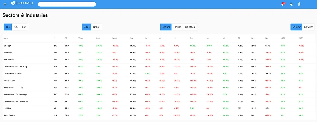
The different columns can be selected from high to low and vice versa and by looking at the different intervals (6 months to 1 week) you can find out which sectors are strengthening or weakening on the long and short term.
Once you have identified the best performing sectors you can then begin to focus on the companies within them to compare and see how performance compares. (Click on the sector itself to see all the stocks within it).
Remember that in an extremely negative market environment all stocks can face (severe) price declines, this is certainly not uncommon. The key here is to look at which companies are the most resilient and can best hold their ground. Companies with little debt and a solid financial reserve are obviously better armed. In this video, I explain how you can use ChartMill to obtain a list of companies that are financially solid.
Create a watchlist of sectors/companies that you want to follow-up further
Once you've made a selection of interesting sectors and/or companies, it's time to create a watchlist. Depending on the number of sectors/shares you're going to follow, you could for instance choose to create a separate watchlist per sector. This isn't necessary but especially if you want to follow up on quite a few positions in the beginning, it's advisable to put as much structure into it as possible. As more stocks are excluded from the watchlist, you can still decide to put the remaining stocks in one watchlist.
How to create a watchlist in ChartMill is shown in this video.
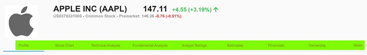
The full profile page is the best place to look at the stocks in detail. You will find our technical and fundamental reports, analyst ratings, estimates, the full financial figures of the company and also all the information about who owns the shares and the insider transactions.
Finally, be sure to check how strong companies are relative to the overall market environment. In ChartMill we have not less than 3 ways to measure relative strength for this purpose.
-
The Mansfield Relative Strength: This variant of Relative Strength was used in the book “Secrets For Profiting in Bull and Bear Markets’ by Stan Weinstein. Weinstein was using the indicator mainly on weekly charts.
-
The Dorsey Relative Strength: This form or Relative Strength was described and used in the book “Point & Figure Charting” by Thomas Dorsey. Dorsey was using XO-charts, but one can also interprete it on a regular chart.
-
ChartMill Relative Strength: At ChartMill we assign a Relative Strength rating number to every stock in our database. The relative strength number of a stock indicates how well the stock has been performing over the last year compared to all other stocks in our database. The maximum number is 100, the minimum number is 0. When a stock has relative strength number 100, it means that it outperformed all other stocks in the database. When the value would be 90, it means that this stock outperformed 90% of all other stocks.
The ChartMill Team
![]()
![]()
![]()
![]()
Disclaimer: These trading ideas are merely to demonstrate what ChartMill is capable of and shows some typical results of a breakout filter. It is in no way actual financial advise to invest or trade in these stocks. The author has no pre-existing position in any of these stocks.